Hadley Wickham is a statistician and programmer and the creator of popular R packages such as ggplot2 or dplyr. His status in the R community has risen to such mythical levels that the set of packages he created were called the hadleyverse (renamed to tidyverse).
In a talk, he describes what he considers a sensible workflow and explains the following dichotomy between data visualization and quantitative modeling:
But visualization fundamentally is a human activity. This is making the most of your brain. In visualization, this is both a strength and a weakness […]. You can see something in a visualization that you did not expect and no computer program could have told you about. But because a human is involved in the loop, visualization fundamentally does not scale.
And so to me the complementary tool to visualization is modeling. I think of modeling very broadly. This is data mining, this is machine learning, this is statistical modeling. But basically, whenever you’ve made a question sufficiently precise, you can answer it with some numerical summary, summarize it with some algorithm, I think of this as a model. And models are fundamentally computational tools which means that they can scale much, much better. As your data gets bigger and bigger and bigger, you can keep up with that by using more sophisticated computation or simply just more computation.
But every model makes assumptions about the world and a model – by its very nature – cannot question those assumptions. So that means: on some fundamental level, a model cannot surprise you.
That definition excludes many economic models. I think of the insights of models such as Akerlof’s Lemons and Peaches, Schelling’s segregation model or the “true and non-trivial” theory of comparative advantage as surprising.
In the first part of this series I showed that term spreads can be used to predict real GDP about a year out. This pattern comes about, because investors expect the central bank to lower short term interest rates.
But we don’t know what’s causing what. Is the central bank driving business cycles or is it just responding to a change in the economic environment?
This matters for how we interpret the pattern we found. Investors could either have expectations about the business cycle or about arbitrary decisions by the central bank.
The central bank’s main tool is changing at the interest rate at which banks can lend, the federal funds rate. In this post, I will look at how the Fed Funds rate comoves with the term spread and how the unexpected component in that rate (the “shock”) is related to it.
I.
First, run all the codes from the previous post.
Get the Fed Funds rate and calculate how it changes between this month and the same month next year:
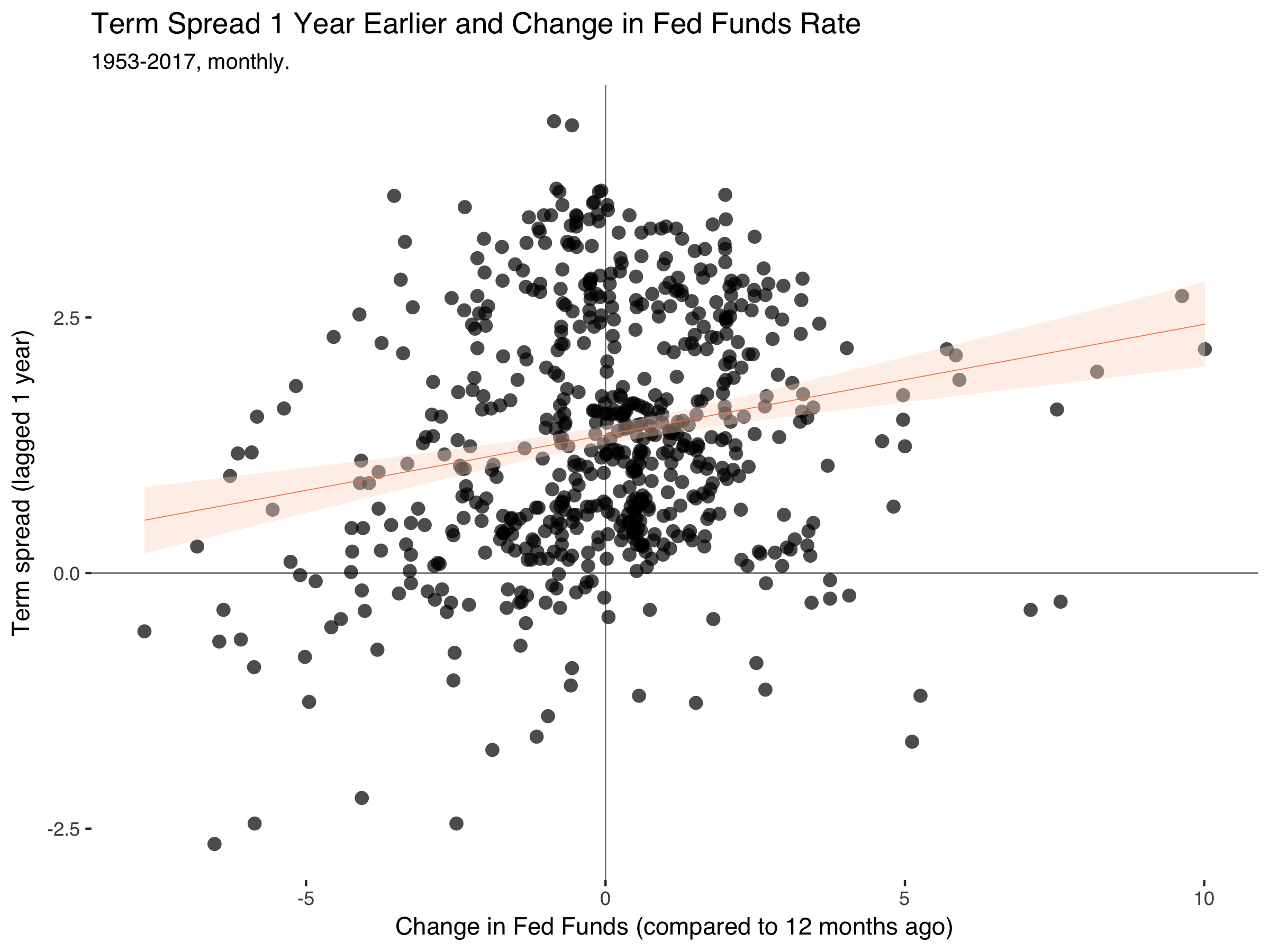
fd%>%filter(date<=2008)%>%ggplot(.,aes(ff_ch,trm_spr))+geom_hline(yintercept=0,size=0.3,color="grey50")+geom_vline(xintercept=0,size=0.3,color="grey50")+geom_point(alpha=0.7,stroke=0,size=3)+geom_smooth(method="lm",size=0.2,color="#ef8a62",fill="#fddbc7")+theme_tufte(base_family="Helvetica")+labs(title="Term Spread 1 Year Earlier and Change in Fed Funds Rate",subtitle="1953-2017, monthly.",x="Change in Fed Funds (compared to 12 months ago)",y="Term spread (lagged 1 year)")
Which gets:
So the pattern is still there. The term spreads drop a year before the Fed Fund rate falls.
II.
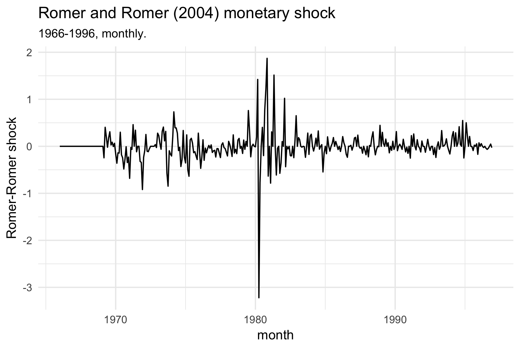
Identifying plausible exogenous variation in monetary policy is the gold standard of monetary economics. A host of other ways have been proposed, but basically every course on empirical macroeconomics starts with the shock series by Romer and Romer (2004).1 This paper filters out the endogenous response of monetary policy with respect to the movement in other economic variables using a regression of the fed funds rate on variables that are important for the central bank’s decision, such as GDP, inflation and the unemployment rate.
I won’t reproduce their analysis here, but just take their shock series from the journal page. For this, we also need the following package to read Excel data:
library(readxl)
The following codes go to the AER website, download the files into a temporary folder (so we don’t have to manually delete them again), unzip the the codes and extract the relevant part:
td<-tempdir()tf<-tempfile(tmpdir=td,fileext=".zip")download.file("https://www.aeaweb.org/aer/data/sept04_data_romer.zip",tf)unzip(tf,files="RomerandRomerDataAppendix.xls",exdir=td,overwrite=TRUE)fpath<-file.path(td,"RomerandRomerDataAppendix.xls")rr<-read_excel(fpath,"DATA BY MONTH")
Plot the shock series:
ggplot(rr,aes(DATE,RESID))+geom_line()+theme_minimal()+labs(title="Romer and Romer (2004) monetary shock",subtitle="1966-1996, monthly.",x="month",y="Romer-Romer shock")
Merge the rr dataframe with our previous fd dataset:
ggplot(fd,aes(shock,trm_spr))+geom_hline(yintercept=0,size=0.3,color="grey50")+geom_vline(xintercept=0,size=0.3,color="grey50")+geom_point(alpha=0.7,stroke=0,size=3)+geom_smooth(method="lm",size=0.2,color="#ef8a62",fill="#fddbc7")+theme_tufte(base_family="Helvetica")+labs(title="Term Spread 1 Year Earlier and Romer-Romer Monetary Policy Shock",subtitle="1966-1996, monthly.",x="Romer-Romer shock",y="Term spread (lagged 1 year)")
Which creates:
Now the pattern is gone.
What I’m learning from this is that term spreads are informative about the endogenous component of monetary policy. Investors have sensible expectations about when the central bank will lower interest rates due to a slowing economic activity.
References
Bernanke, B., J. Boivin and P. Eliasz (2005). “Measuring the
Effects of Monetary Policy: A Factor-Augmented Vector
Autoregressive (FAVAR) Approach”, Quarterly Journal of Economics. (link)
Christiano, L., M. Eichenbaum and C. Evans (1996). “The Effects of Monetary Policy Shocks: Some Evidence from the Flow of Funds”, Review of Economics and Statistics. (link)
Nakamura, E. and J. Steinsson (2018). “High-Frequency Identification of Monetary Non-Neutrality: The Information Effect”, Quarterly Journal of Economics. (link)
Romer, C. D. and D. H. Romer (2004). “A New Masure of Monetary Shocks: Derivation and Implications”, American Economic Review. (link)
Uhlig H. (2005). “What Are the Effects of Monetary Policy on Output? Results from an Agnostic Identification Procedure”, Journal of Monetary Economics. (link)
A typical problem when analyzing large amounts of text is trying to measure the similarity of documents. An established measure for this is cosine similarity.
I.
It’s the cosine of the angle between two vectors. Two vectors have a maximum cosine similarity of 1 if they are parallel and the lowest cosine similarity of 0 if they are perpendicular to each other.
Say you have two documents \(A\) and \(B\) . Write these documents as vectors \(\boldsymbol{x} = (x_{1}, x_{2}, ..., x_{n})'\), where \(n\) is the length of the pooled dictionary of all words that show up in either document. An entry \(x_i\) is the number of occurences of a particular word in a document. Cosine similarity is then (Manning et al. 2008):
Given that entries can only be positive, cosine similarity will always take positive values. The denominator normalizes document lengths and bounds values between 0 and 1.
Cosine similarity is equal to the usual (Pearson’s) correlation coefficient if we first demean the word vectors.
II.
Consider a dictionary of three words. Let’s define (in Matlab) three documents that contain some of these words:
Documents 1 and 2 again have the lowest possible similarity. The association between documents 2 and 3 is especially high, as both contain the third word in the dictionary which also happens to be of particular importance in document 3.
Demean the vectors and then run the same calculation:
The more than 7,200 pages now extant probably represent about one-quarter of what Leonardo actually wrote, but that is a higher percentage after five hundred years than the percentage of Steve Jobs’s emails and digital documents from the 1990s that he and I were able to retrieve.
I also liked this:
Leonardo’s Vitruvian Man embodies a moment when art and science combined to allow mortal minds to probe timeless questions about who we are and how we fit into the grand order of the universe. It also symbolizes an ideal of humanism that celebrates the dignity, value, and rational agency of humans as individuals. Inside the square and the circle we can see the essence of Leonardo da Vinci, and the essence of ourselves, standing naked at the intersection of the earthly and the cosmic.
This is the first part of a series of posts on term spreads and business cycles. There'll probably be three parts.
The term spread is the return differential between a long-term and a short-term safe bond. We can use this to learn about how market participants expect the economy to perform over the next year or so.
Consider an investor who either buys a long-run bond running for two years and pays \(i_{2,t}\) per year or he invests in two subsequent short-run bonds. If he chooses the second option, the bond pays \(i_{1,t}\) in the first year and he expects to earn \(i^e_{1,t+1}\) in the second year. If we neglect any risk, it’s plausible to assume that interests rates adjust such that the investor earns the same using either strategy:
So long-term interest rates are composed of expectations about future short term interest rates.
Combine this with what the Cecchetti and Schoenholtz call the Liquidity Premium Theory. Returns that accrue farther into the future are more risky, as the bond issuer may be bankrupt and we don’t know what inflation will be. This means that rates on bonds with longer maturities are usually higher.
The authors add a factor \(rp_n\) (the risk premium of a bond running \(n\) years) to the original equation:
A positive term spread can mean two things. Either we expect the average future short-term interest rate to rise or the difference between the two risk premia (\(rp_n - rp_1\)) has increased. We would expect this difference to be positive anyway, but it might widen even more when inflation becomes more uncertain or debt becomes riskier. But disentangling the two explanations is difficult.
It’s more interesting when the term spread turns negative. The difference between the risk premia probably stays positive, so investors expect short-term interest rates to decrease.
Short-term interest rates are mostly under the control of the central bank, so this probably means that people expect monetary policy to loosen and that the central bank lends more liberally to banks.
And why would the central bank do that? That’s usually to avert a looming recession and buffer negative shocks. Given that the central bank also responds to changes in the economic environment, it’s not clear what’s causing what here.
But either way, when term spreads turn negative, investors expect bad things. This is why the term spread tells us something about investors’ expectations.
II.
Let’s look at the empirical evidence for this, as argued and presented by the authors. They kindly provide Fred codes with all their plots, so they’re easy to reproduce. First get some packages in R:
# Long-term interest ratesfd<-fred$series.observations(series_id="GS10")%>%mutate(date=as.Date(date))%>%select(date,t10=value)%>%mutate(t10=as.numeric(t10))# Short-term interest ratesfd<-fred$series.observations(series_id="TB3MS")%>%mutate(date=as.Date(date))%>%select(date,tb3m=value)%>%mutate(tb3m=as.numeric(tb3m))%>%full_join(fd)# Turn dates into month-years and order by datesfd<-fd%>%mutate(date=as.yearmon(date))%>%arrange(date)
Plot the two series:
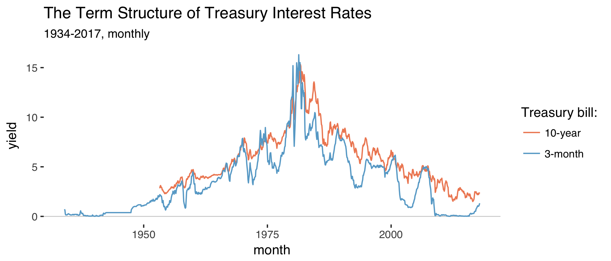
fd%>%gather(var,val,-date)%>%ggplot(aes(date,val,color=var))+geom_hline(yintercept=0,size=0.3,color="grey80")+geom_line()+labs(title="The Term Structure of Treasury Interest Rates",subtitle="1934-2017, monthly",x="month",y="yield",color="Treasury bill:")+scale_color_manual(labels=c("10-year","3-month"),values=c("#ef8a62","#67a9cf"))+theme_tufte(base_family="Helvetica")
Which produces:
The series on 3-month Treasury bond yields starts in 1934 and the other series on 10-year yields starts in 1953. Both series peak in the early 80s when inflation ran high. As argued before, long-run interest rates are usually above short-run interest rates. The term spread is the difference between the two:
fd<-fd%>%mutate(trm_spr=t10-tb3m)
Things become more interesting when we compare the behavior of the term spread with real GDP growth rates:
# Get quarterly GDPqt<-fred$series.observations(series_id="GDPC1")%>%mutate(yq=as.yearqtr(paste0(year(date)," Q",quarter(date))))%>%select(yq,rgdp=value)%>%mutate(rgdp=as.numeric(rgdp),gr=100*(rgdp-dplyr::lag(rgdp,4))/dplyr::lag(rgdp,4))# Aggregate monthly to quarterly and get lagqt<-fd%>%mutate(yq=as.yearqtr(date))%>%group_by(yq)%>%summarize(trm_spr=mean(trm_spr))%>%mutate(trm_spr_l=dplyr::lag(trm_spr,4))%>%full_join(qt,by="yq")%>%filter(yq>="1947 Q1")
Make a plot of the two series:
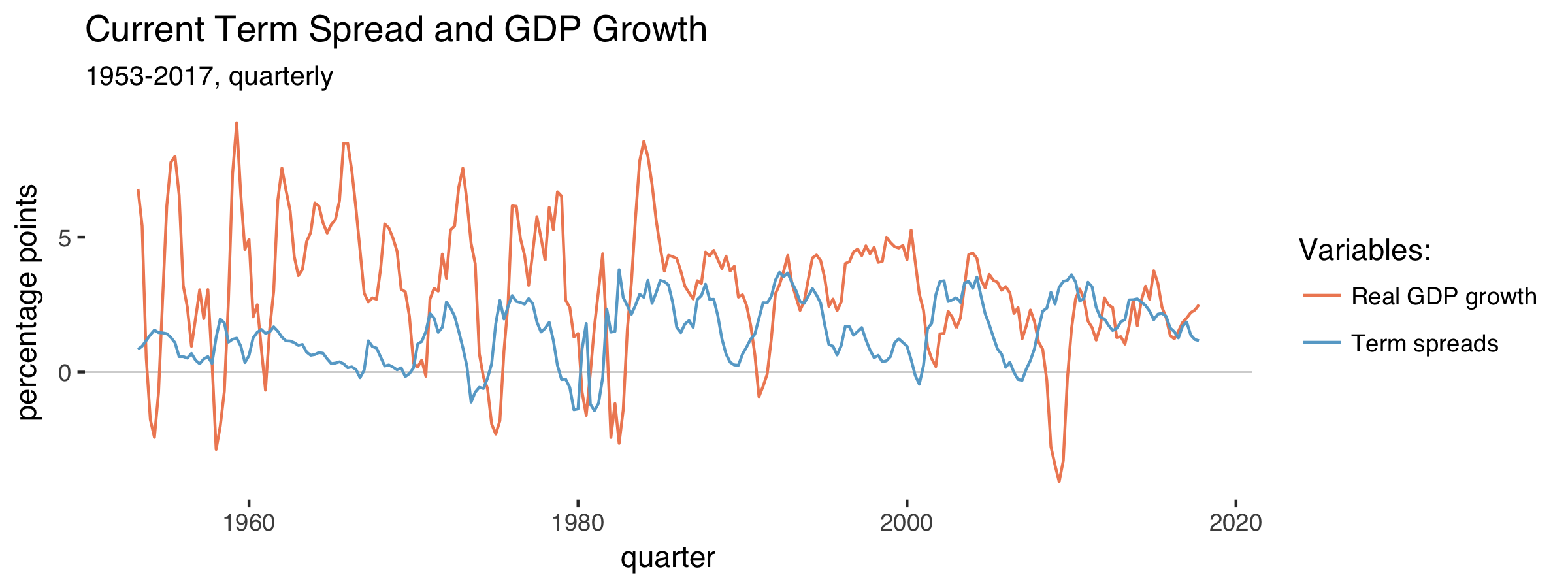
qt%>%select(-rgdp,-trm_spr_l)%>%drop_na(trm_spr)%>%gather(var,val,-yq)%>%ggplot(aes(yq,val,color=var))+geom_hline(yintercept=0,size=0.3,color="grey80")+geom_line()+labs(title="Current Term Spread and GDP Growth",subtitle="1953-2017, quarterly",x="quarter",y="percentage points",color="Variables:")+theme_tufte(base_family="Helvetica")+scale_color_manual(labels=c("Real GDP growth","Term spreads (lagged)"),values=c("#ef8a62","#67a9cf"))
We get:
The term spread often falls before GDP growth does. When the term spread turns negative, recessions tend to happen. Compare the lagged term spread to GDP growth:
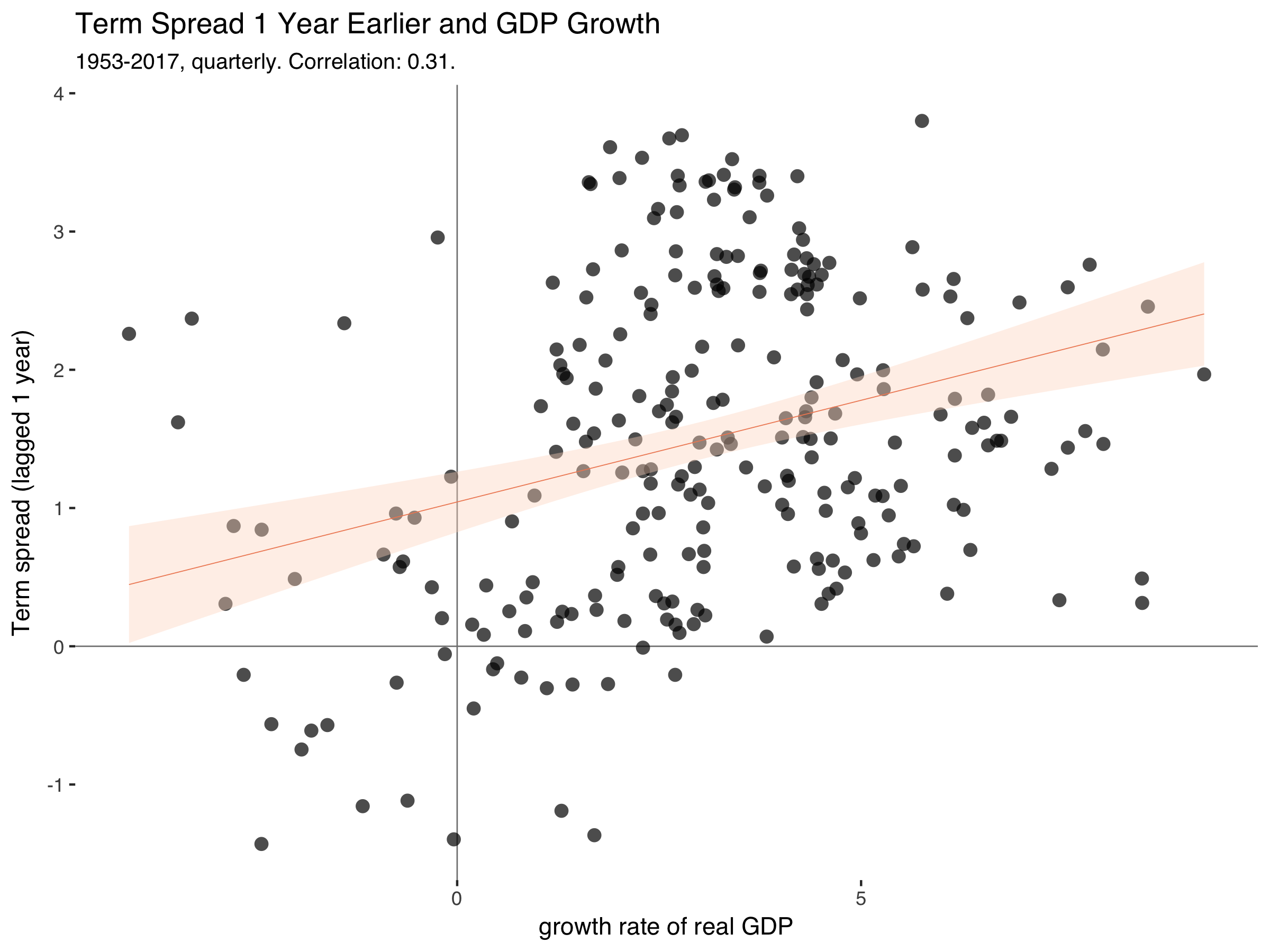
qt%>%filter(yq>=1953)%>%ggplot(aes(gr,trm_spr_l))+geom_hline(yintercept=0,size=0.3,color="grey50")+geom_vline(xintercept=0,size=0.3,color="grey50")+geom_point(alpha=0.7,stroke=0,size=3)+labs(title="Term Spread 1 Year Earlier and GDP Growth",subtitle=paste0("1953-2017, quarterly. Correlation: ",round(cor(qt$gr,qt$trm_spr_l,use="complete.obs"),2),"."),x="growth rate of real GDP",y="Term spread (lagged 1 year)")+geom_smooth(method="lm",size=0.2,color="#ef8a62",fill="#fddbc7")+theme_tufte(base_family="Helvetica")
Which gets us:
This is exactly the relationship that makes people think of term spreads as a good predictor of GDP in the near future.
III.
Cecchetti and Schoenholz summarize it like this (p.180):
[…] [I]nformation on the term structure – particularly the slope of the yield curve – helps us to forecast general economic conditions. Recall that according to the expectations hypothesis, long-term interest rates contain information about expected future short-term interest rates. And according to the liquidity premium theory, the yield curve usually slopes upward. The key statement is usually. On rare occasions, short-term interest rates exceed long-term yields. When they do, the term stucture is said to be inverted, and the yield curve slopes downward.
[…] Because the yield curve slopes upward even when short-term yields are expected to remain constant – it’s the average of expected future short-term interest rates plus a risk premium – an inverted yield curve signals an expected fall in short-term interest rates. […] When the yield curve slopes downward, it indicates that [monetary] policy is tight because policymakers are attempting to slow economic growth and inflation.
We still don’t know what’s causing what. Is the central bank the driver of business cycles or is it just responding to a change in the economic environment?
Stay tuned for the next installment in this series in which I’ll look at the role of monetary policy.
References
Cecchetti, S. G. and K. L. Schoenholtz (2017). “Money, Banking, and Financial Markets”. 5th edition, McGraw-Hill Education. (link)
Susan Athey presented “Online Intermediaries and the Consumption of Polarized and Inaccurate News During the 2016 Presidential Election” in this session. They tried to estimate what the political leanings of media were that people consumed during the 2016 Presidential Election. They document that most of the media is left of center. But the strongest result is that they show a lack of reliable right-wing media. She explained that if they hadn’t coded Fox News as at least moderately accurate, then there would be no such right-wing media outlet.
“Credit Booms, Aggregate Demand, and Financial Crises”, included a new paper by Matthew Baron, Emil Verner and Wei Xiong. They painstakingly digitized historical bank equity returns to create a new financial crisis indicator for 47 countries since 1800.
What have I learned from this? First, everything takes time. Coming up with compelling research takes time. Data collection takes time. Data analysis takes time. Writing takes time. Peer review takes time. Rejection takes time. Recovery from rejection takes time. Responding to reviewers takes time. Typesetting takes time. Email takes time. Writing this blog post takes time. Everything takes time. It’s been eight years but that time has brought a publication I’m quite proud of.
Brian Hayes provides a readable introduction to net neutrality:
In round numbers, the web has something like a billion sites and four billion users—an extraordinarily close match of producers to consumers. […] Yet the ratio for the web is also misleading. Three fourths of those billion web sites have no content and no audience (they are “parked” domain names), and almost all the rest are tiny. Meanwhile, Facebook gets the attention of roughly half of the four billion web users. Google and Facebook together, along with their subsidiaries such as YouTube, account for 70 percent of all internet traffic.
Stephen Broadberry and John Joseph Wallis have written an interesting new paper (pdf). They argue that much of modern economic growth is due to not only a higher trend growth rate, but also due to fewer periods of shrinking.
It’s easy to reproduce some of their results using the nice maddison package.
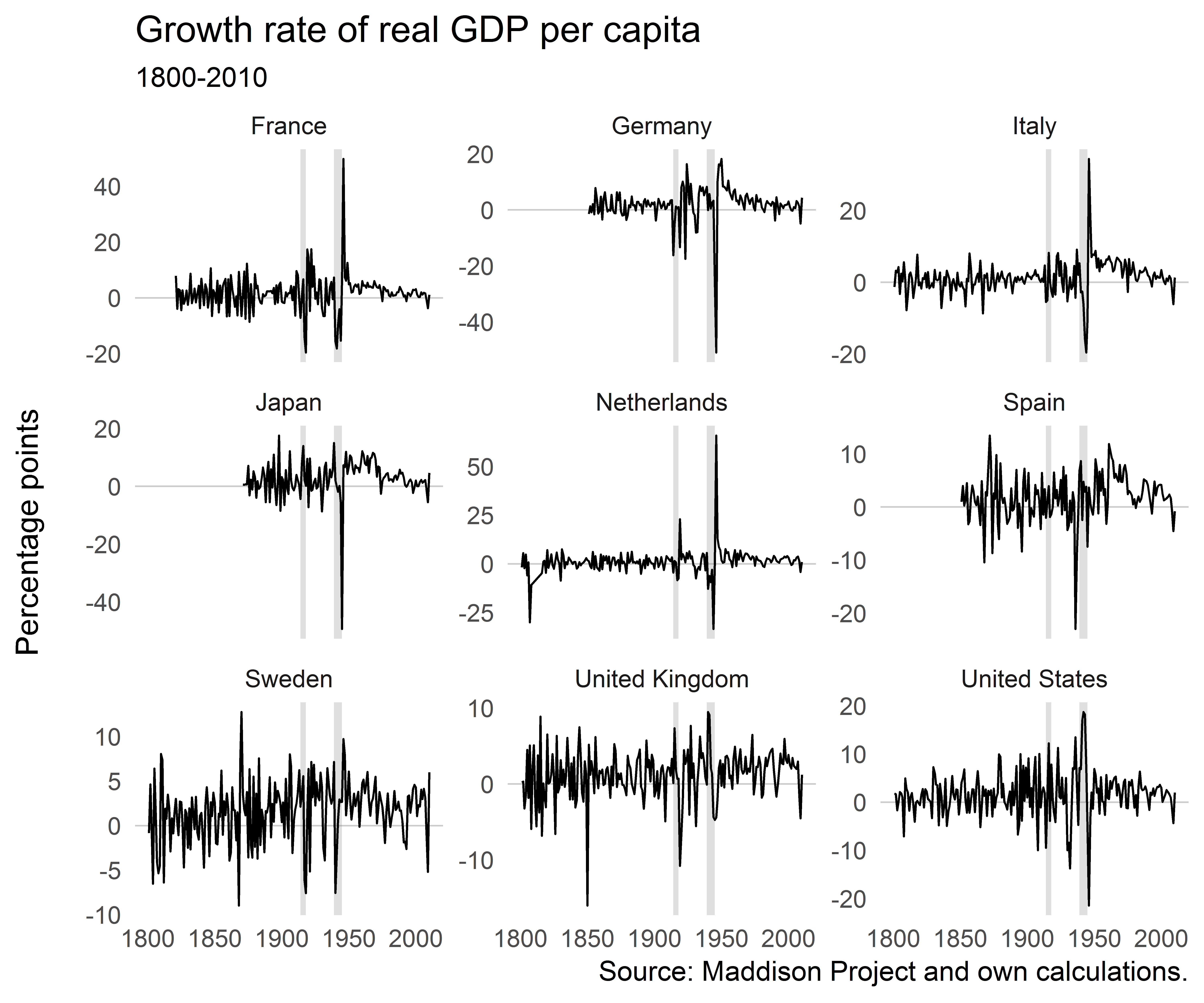
Let’s concentrate on some countries with good data coverage, keep only data since 1800 and calculate real GDP growth rates. We also add a column for decades, to be able to look at some statistics for those separately.
df%>%filter(iso2c%in%c("DE","FR","IT","JP","NL","ES","SE","GB","US"))%>%ggplot()+geom_hline(yintercept=0,size=0.3,color="grey80")+geom_rect(aes(xmin=xmin,xmax=xmax,ymin=ymin,ymax=ymax),data=df_annotate,fill="grey50",alpha=0.25)+geom_line(aes(year,gr),size=0.4)+facet_wrap(~country,scales="free_y")+ggthemes::theme_tufte(base_family="Helvetica",ticks=FALSE)+labs(x=NULL,y="Percentage points\n",title="Growth rate of real GDP per capita",subtitle="1800-2010")
Growth rates wobble around a mean slightly larger than zero, as expected. There are some extreme events around the World Wars. But it’s not immediately apparent from looking at these figures if shrinking has become less. If anything, it’s macroeconomic volatility that has decreased for most of these countries.
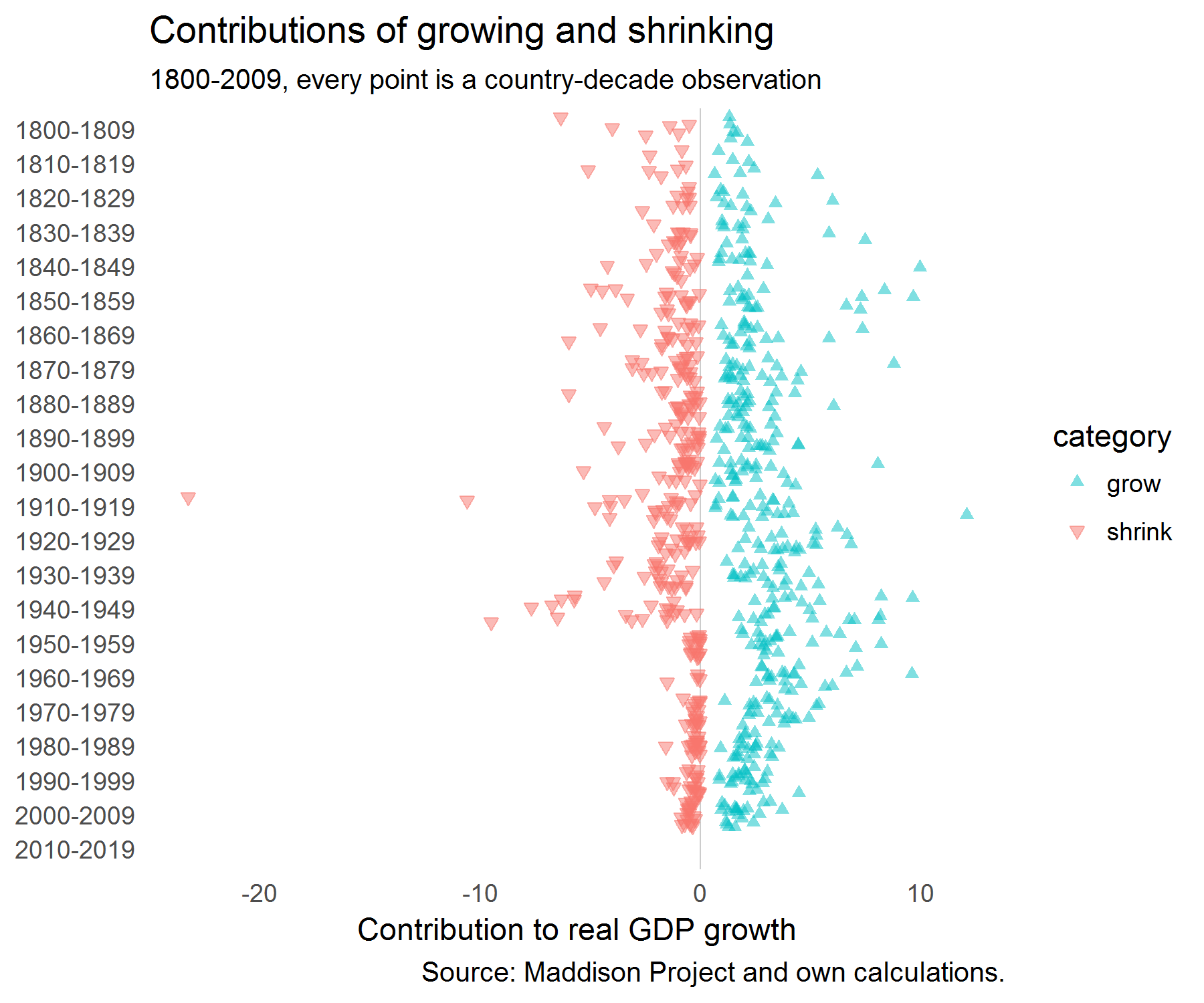
Next, for each decade we calculate the number of periods that countries were growing and shrinking and the average growth rates in those periods.
We’re interested in how much growing and shrinking years contributed to overall growth in a decade. So this is just the absolute value of changes by either shrinking and growing years divided by the total variation.
stats<-stats%>%full_join(stats%>%group_by(decade,iso3c,country_original,country,gr_av)%>%summarise(tvar=sum(abs(comp)),gr_comp=sum(comp)))%>%mutate(contr=abs(comp)/tvar)mutate(dfac=factor(decade))%>%filter(decade!="2010-2019")ggplot(stats,aes(dfac,comp,color=category,shape=category,fill=category))+geom_hline(yintercept=0,size=0.3,color="grey80")+geom_jitter(alpha=0.5)+coord_flip()+ggthemes::theme_tufte(base_family="Helvetica",ticks=FALSE)+scale_shape_manual(values=c(17,25))+scale_colour_manual(values=c("#00BFC4","#F8766D"))+scale_fill_manual(values=c("#00BFC4","#F8766D"))+labs(title="Contributions of growing and shrinking",subtitle="1800-2009, every point is a country-decade observation",y="Contribution to real GDP growth",x=NULL,caption="Source: Maddison Project and own calculations.")+scale_x_discrete(limits=rev(levels(stats$dfac)))
When we plot those contributions, we get the following picture:
It looks as if the contributions of shrinking have clustered closer to zero since WW2.
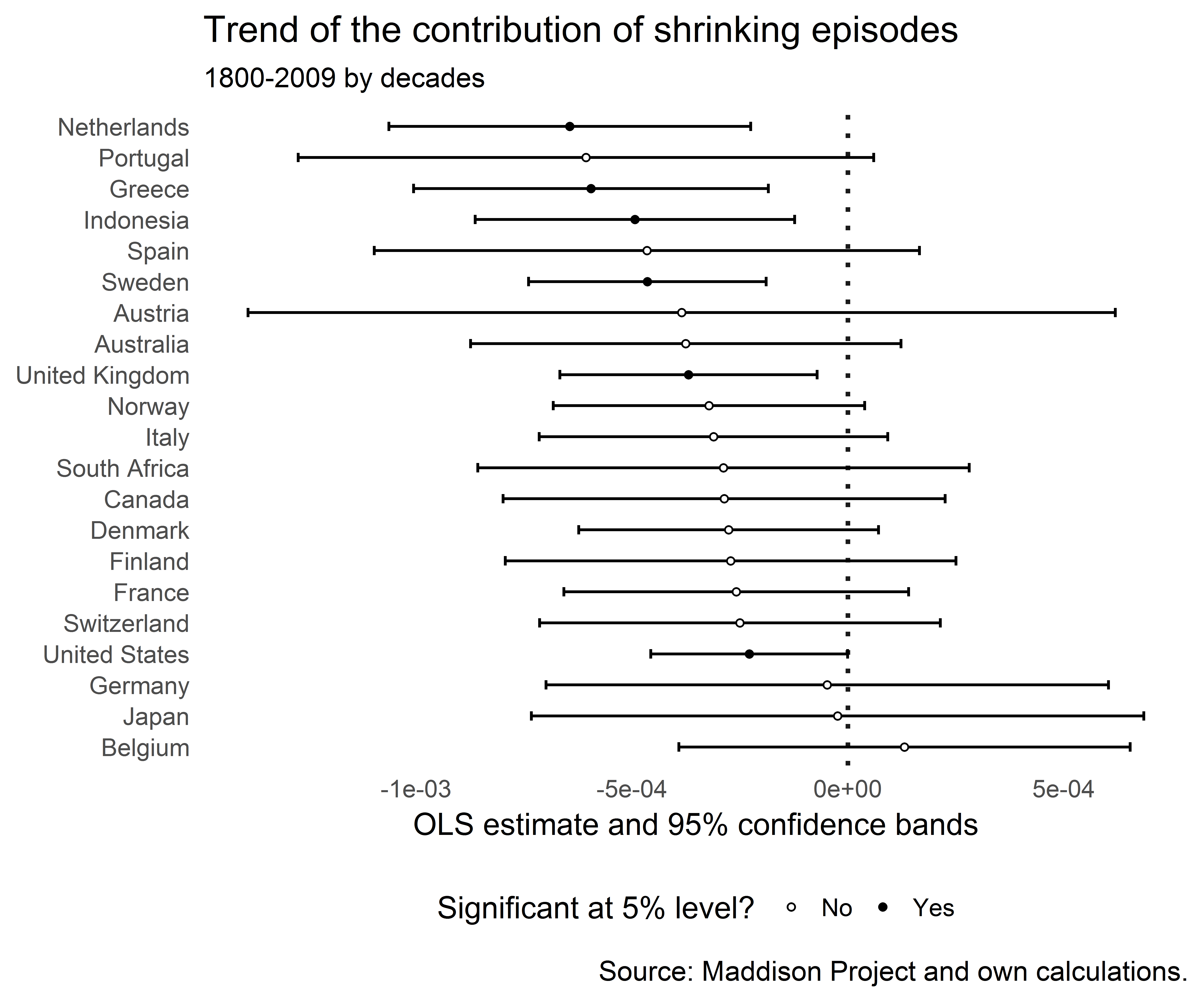
Let’s check out the trends in the contribution of shrinking periods:
And plot the regression coefficients of the trend line:
r%>%filter(term=="trend")%>%arrange(estimate)%>%ggplot(aes(reorder(country,-estimate),estimate))+geom_hline(yintercept=0,size=0.8,color="grey10",linetype="dotted")+geom_errorbar(aes(ymin=conf.low,ymax=conf.high),width=0.3)+geom_point(aes(y=estimate,fill=sig),shape=21,size=1.0,color="black")+coord_flip()+theme_tufte(base_family="Helvetica",ticks=FALSE)+labs(title="Trend of the contribution of shrinking episodes",subtitle="1800-2009 by decades",x=NULL,y="OLS estimate and 95% confidence bands",caption="Source: Maddison Project and own calculations.")+scale_fill_manual(name="Significant at 5% level?",labels=c("No","Yes"),values=c("white","black"))+theme(legend.position="bottom")
The trend was negative for many countries and for some there was no significant trend. None of the trends was significantly positive. It certainly looks as if episodes of growing output have become more important than episodes of shrinking episodes.
The question remains whether this might not just be mechanically driven by the fact that a higher trend real GDP growth rate reduces the probability of the growth rate hitting zero. And a fall in macroeconomic volatility would also make shrinking episodes less likely.
References
Broadberry, S. and J. J. Wallis (2017). “Growing, Shrinking, and Long Run Economic Performance: Historical Perspectives on Economic Development”, NBER Working Paper No. 23343. doi: 10.3386/w23343
The assessment of that effect … is not as straightforward as many people think. And I’m not a fan of economic models, because they have all proven wrong. (link)
This past weekend, the biggest story on social media was not about a powerful man who had sexually assaulted someone, or something the president said on Twitter. Charmingly, as if we were all at a Paris salon in the 1920s, everyone had an opinion about a short story.