This recent paper in Nature Communications is a really cool (source):
We analysed a database of 21,745,538 lines of computer code in total and 483,173 unique lines, originating from 47,967 entries to 19 online collaborative programming competitions organised over the course of 14 years by the MathWorks software company. In every contest, the organisers set a computational challenge and, over the course of one week, participants developed and provided solutions in the form of MATLAB® code.
Shipping a 70kg parcel from Shanghai to London with DHL Express takes three times longer, and costs four times as much, as buying a human of the same weight an airline ticket. The passenger gets a baggage allowance and free drinks, too.
Bundesrechnungshof (German Federal Audit Office) laments(in German) the fact that Germany subsidizes the tabaco industry. On average, the 11,000 employees receive 600 cigarettes per month. This was introduced after World War One to reduce stealing by employees.
Jonathan Schwabish’s book “Better Presentations” is very good. The author wrote this paper in the Journal of Economic Perspectives some years ago and I really enjoyed that then. The book expands on the themes of the paper.
He emphasizes the need to better tailor presentations to the audience. He has a simple set of notes to get one started (see the “Better Presentations Worksheet” here). A presentation in a research seminar can go into great depth, but a presentation at a large diverse conference or a presentation to funding providers should not. The less well acquainted people are with the topic, the more important is providing context about one’s research.
The most important point Schwabish makes is his explanation of the pyramid, the inverted pyramid and the hourglass. The pyramid is the traditional form of presentation where you first set the stage by mentioning your research hypothesis, review the literature, then introduce the data, explain your methods and - last - reveal what you find.
Most researchers have by now realized that this is not a good idea. People don’t know where the presentation is headed and what’s important. An alternative model comes from journalism: The inverted pyramid. Start with a bang and tell the reader all about what you’ve found out. And then you keep adding more details later on.
But, as the author points out, you can do both and combine the two to an hourglass structure. You start broad, provide context for who you are, what you’re working on and why. You set the right expectations of what your paper is about. Then go into more details and explain exactly what you’re doing. In the end, you zoom out again: What did we just learn that’s new and why does it matter?
I watch too many people run out of time at the end of their presentation and say, “Let me just quickly show you these two regression tables of robustness tests.” No! The end of your presentation is too important to waste it on a regression table. The audience is most attentive at the beginning and end, so don’t waste those moments on details.
I also learned a number of smaller points:
Get rid of bullet points and just start items directly.
Cooler colors (blue, green) pull away from you into the page, warmer colors (red, yellow) pop out.
Schwabish refutes the idea that you should only have X slides per Y minutes. He considers such metrics too crude and thinks it leads to bad design. It encourages people to put too much text on slides. It’s better to split thoughts into more slides because that’s what slide shows excel at.
He recommends breaking the white we normally use as slide background to a light gray. I’ve tried that, but it leads to other problems: Our statistical software draws graphs with white backgrounds, so figures stand out against the gray background and it looks strange. I think it’s overkill to change the background color in every figure we draw and it’s better to just continue using white as the background color.1
In economics, most of us use Latex Beamer and I don’t think we’re doing us a favor with that. It’s great to write equations, so maybe it’s the right choice for theory papers.2 But the majority of papers nowadays have a focus on empirics and include many figures and for these it’s not a good tool: Just try moving your Latex figure a little to the right, try making it full size or try adding a little text on top of your figure. And everything takes so much longer! You type \textit{} for italics and then have to watch your Latex compile … and fail because you’ve mistyped something or have forgotten a curly bracket.
I switched back to PowerPoint a year ago and I much prefer that now. The most tricky thing I find including regression tables from Latex.3 But most of those probably shouldn’t be in our presentations anyway and those that we do include can do with much less information (no standard errors, covariates, R², …) than we put into our papers. In conclude that using Latex Beamer is mostly signaling.
Anyway, the book by Schwabish is great and I recommend it.
References
Schwabish, Jonathan A. (2014). “An Economist’s Guide to Visualizing Data”. Journal of Economic Perspectives, 28(1): 209-234.
Schwabish, Jonathan A. (2016). Better Presentations: A Guide for Scholars, Researchers, and Wonks. Columbia University Press. (link)
Eric points out that (in R) you can use no background color, by adding + theme(plot.background = element_blank(), panel.background = element_blank()) to your ggplot(...). ↩
Whether slide shows are the appropriate way to explain complicated theory is another question. For lectures, I’m positively convinced that it’s inferior to writing equations on the board, as that leads to a slower and more phased-in introduction of new material. ↩
I now use the for-pay version of Adobe to convert regression tables from pdf to word. In word I can change fonts, then I copy tables and paste them into PowerPoint with right click “Picture”. This works perfectly for me. ↩
Separating the cycle from the trend of a time series is a common activity for macroeconomists. The choice of how to detrend variables can have major effects on firms and the economy as a whole. For example, the “Credit-to-GDP gaps” by the BIS are used by financial market regulators to decide on how to adjust counter-cyclical capital buffers which could mean that banks have to issue more capital. Estimating a different cycle can therefore directly affect bank profitability.
The usual method to detrend macroeconomic variables is the Hodrick-Prescott (HP) filter. The HP filter is nice, because it’s easy to understand and implement. The choice of \(\lambda\) allows using outside knowledge to set a cycle length that we consider reasonable.
But along came James Hamilton who wrote a paper last year called “Why you should never use the Hodrick-Prescott filter” (published, voxeu, pdf). He criticizes that the HP filter has no theoretical foundation and that it doesn’t accomplish what we would like it to do.
Hamilton proposes a better way to detrend. First, you choose an appropriate cycle length. Then - for every point in time - the trend is the value you would have predicted one cycle ago with a linear regression. To appropriately model time series behavior and (as a nice side effect) capture seasonalities, you pick multiples of 4 for quarterly and of 12 for monthly frequencies.
In this post, I’ll show how to implement the new Hamilton detrending method and compare it with the HP filter. I’ll take one of the variables that Hamilton uses in his paper and get exactly the same values.
II.
First, load some packages (see here how to use FredR):
Get nonfarm employment data from Fred. We keep only end of quarter values to use the same sample as Hamilton (first quarter of 1947 to last quarter of 2016). And we transform the data the same way (“100 times the log of end-of-quarter values”):
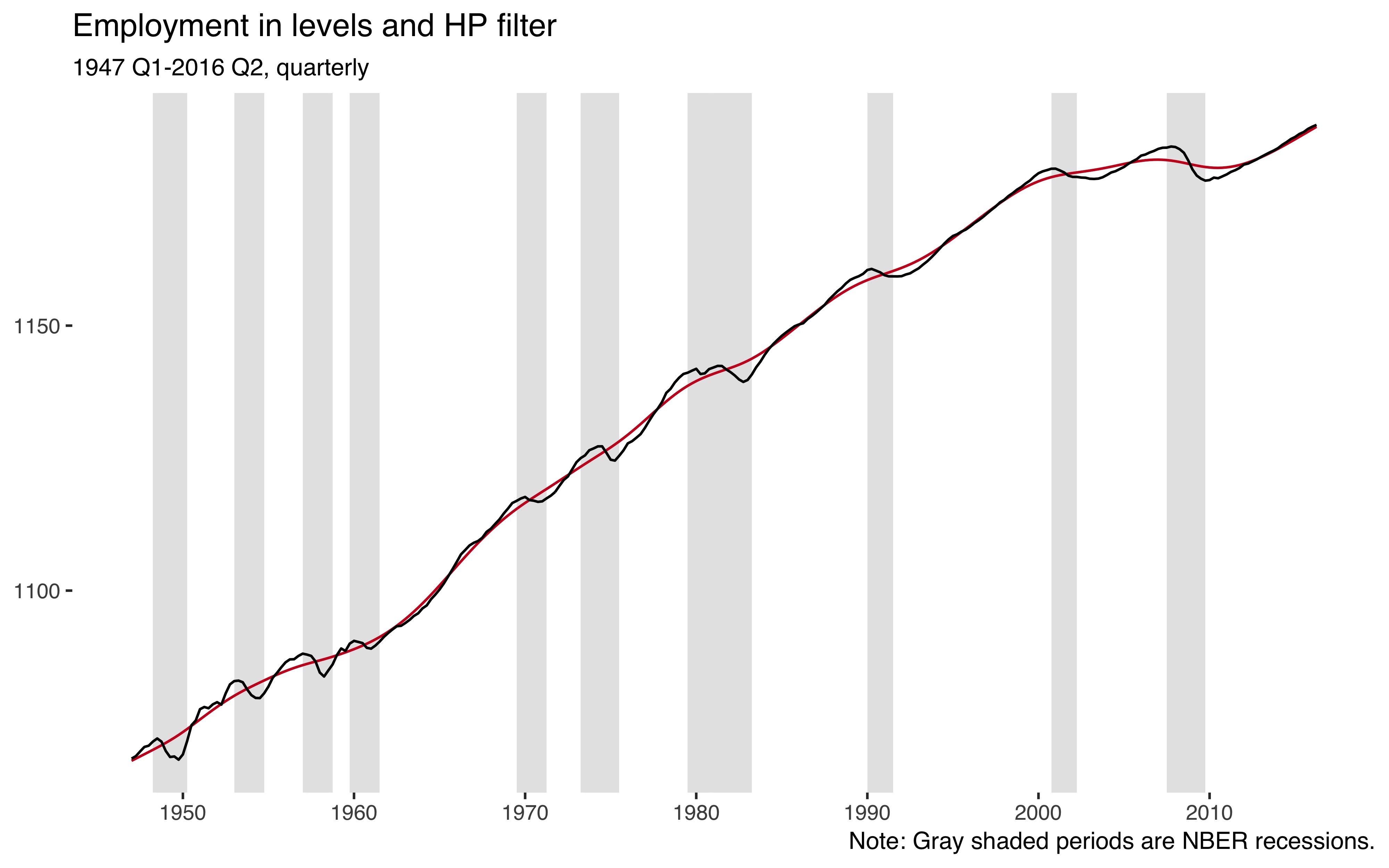
ggplot()+geom_rect(aes(xmin=date-0.5,xmax=date+0.5,ymin=-Inf,ymax=Inf),data=usrec,fill="gray90")+geom_line(data=df,aes(date,hp_trnd),color="#ca0020")+geom_line(data=df,aes(date,emp))+theme_tufte(base_family="Helvetica")+labs(title="Employment in levels and HP filter",x=NULL,y=NULL,subtitle="1947 Q1-2016 Q2, quarterly",caption="Note: Gray shaded periods are NBER recessions.")+scale_x_continuous(breaks=seq(1950,2010,by=10))
So employment is an upwards trending variable and the HP filter (red line) nicely captures that trend.
Next, I implement the new procedure from Hamilton (2017). First, we’ll need some lags of our employment variable. For this, I like to use data.table:
If the true data generating process was a random walk, the optimal prediction would just be its value two years ago. We can calculate this random walk version (\(y_{t} - y_{t-8}\)) right away:
df<-df%>%mutate(cl_noise=emp-emp_lag8)
We want to now regress the current level of the employment variable on lags 8 to 11.
cc# A tibble: 556 x 4# date var val label # <S3: yearqtr> <chr> <dbl> <chr> # 1 1947 Q1 cl_noise NA Random walk# 2 1947 Q2 cl_noise NA Random walk# 3 1947 Q3 cl_noise NA Random walk# 4 1947 Q4 cl_noise NA Random walk# 5 1948 Q1 cl_noise NA Random walk# 6 1948 Q2 cl_noise NA Random walk# 7 1948 Q3 cl_noise NA Random walk# 8 1948 Q4 cl_noise NA Random walk# 9 1949 Q1 cl_noise 1.44 Random walk# 10 1949 Q2 cl_noise -0.158 Random walk# ... with 546 more rows
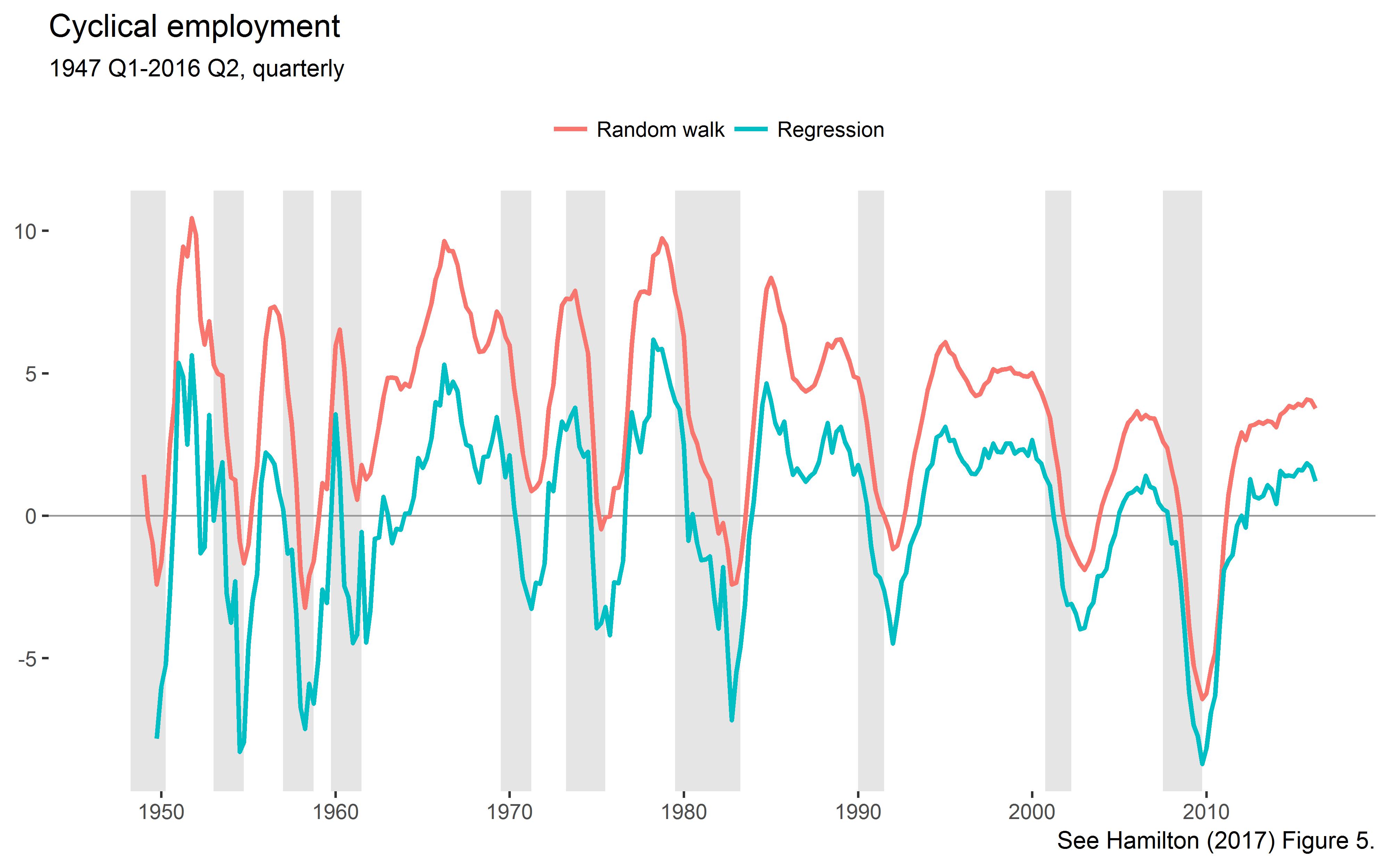
Plot the new cycles:
ggplot()+geom_rect(aes(xmin=date-0.5,xmax=date+0.5,ymin=-Inf,ymax=Inf),data=usrec,fill="gray90")+geom_hline(yintercept=0,size=0.4,color="grey60")+geom_line(data=cc,aes(date,val,color=label),size=0.9)+theme_tufte(base_family="Helvetica")+labs(title="Cyclical employment",subtitle="1947 Q1-2016 Q2, quarterly",color=NULL,x=NULL,y=NULL,caption="See Hamilton (2017) Figure 5.")+theme(legend.position="top")+scale_x_continuous(breaks=seq(1950,2010,by=10))
This is the lower left panel of Hamilton’s Figure 5.
Let’s check out the moments of the extracted cycles:
cc%>%group_by(var,label)%>%summarise(cl_mn=mean(val,na.rm=TRUE),cl_sd=sd(val,na.rm=TRUE))# A tibble: 2 x 4# Groups: var [?]# var label cl_mn cl_sd# <chr> <chr> <dbl> <dbl># 1 cl_noise Random walk 3.44e+ 0 3.32# 2 cl_reg Regression -4.10e-13 3.09
As explained by Hamilton, the noise component has a positive mean, but the regression version is demeaned. The standard deviations exactly match those reported by Hamilton in Table 2.
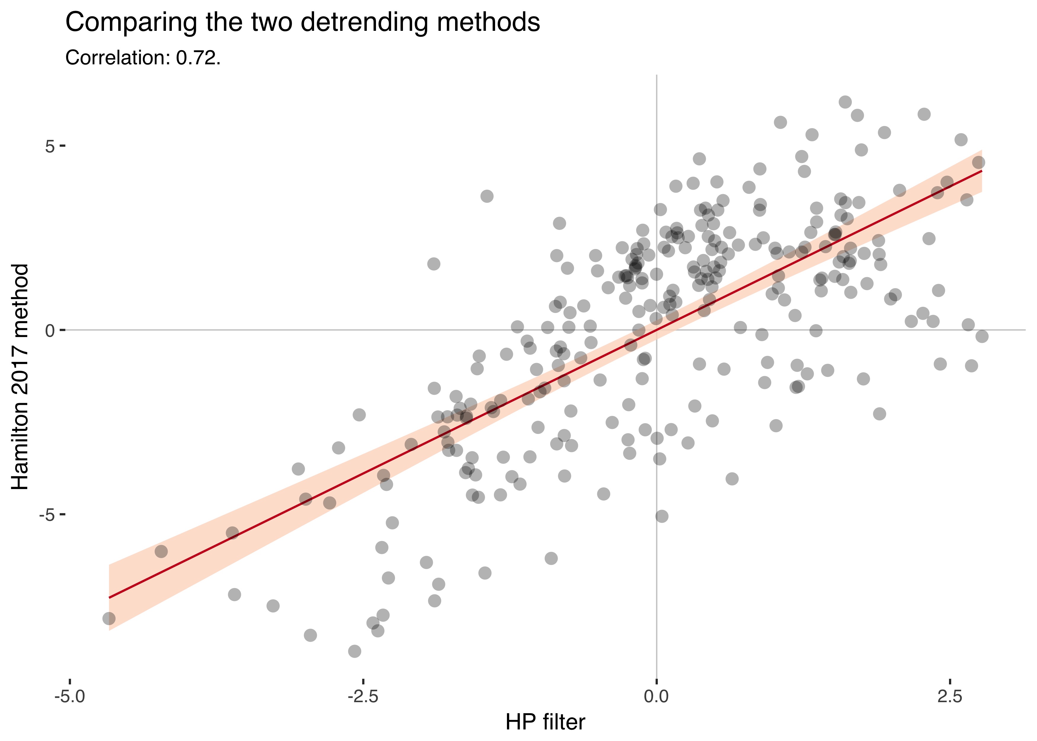
Let’s compare the HP filtered cycles with the alternative cycles:
ggplot(df,aes(hp_cl,cl_reg))+geom_hline(yintercept=0,size=0.3,color="grey80")+geom_vline(xintercept=0,size=0.3,color="grey80")+geom_smooth(method="lm",color="#ca0020",fill="#fddbc7",alpha=0.8,size=0.5)+geom_point(stroke=0,alpha=0.3,size=3)+theme_tufte(base_family="Helvetica")+labs(title="Comparing the two detrending methods",subtitle=paste0("Correlation: ",round(cor(df$hp_cl,df$cl_reg,use="complete.obs"),2),"."),x="HP filter",y="Hamilton 2017 method")
The two series have a correlation of 0.72.
III.
I understand the criticism of the HP filter, but at least everyone knew that it was just a tool you used. You eyeballed your series and tried to extract reasonable trends.
With the new procedure, the smoothing parameter \(\lambda\) is gone, but instead we have to choose how many years of data to skip to estimate the trend. Hamilton recommends taking a cycle length of two years for business cycle data and five years for the more sluggish credit aggregates. Isn’t that a bit arbitrary, too?
Having to pick whole years as cycle lengths also makes the method quite coarse-grained, as the parameter “years” can only be set to positive integers. Another downside is that the new method truncates the beginning of your sample, because you use that data to estimate the trend. This is a nontrivial problem in macro, where time dimensions are often short.
The Hamilton detrending method has additional benefits, though: It’s backward-looking, while the HP-filter also uses data that’s in the future (but an alternative backward-looking version exists). Also, it adjusts for seasonality by default.
We can only benefit from a better understanding of the problems of the HP filter. And we can always compare results using both methods.
References
Hamilton, James D. (2017). “Why you should never use the Hodrick-Prescott filter.” Review of Economics and Statistics. (doi)
I’ve uploaded a new working paper called “Patterns of Panic: Financial Crisis Language in Historical Newspapers”, available here. In the paper, I’m analyzing titles of these five major US newspapers since the 19th century to construct a new indicator of financial stress:
Newspaper
Since
Titles
Chicago Tribune
1853
9.0m
Boston Globe
1872
6.7m
Washington Post
1877
7.7m
Los Angeles Times
1881
7.9m
Wall Street Journal
1889
3.9m
For the paper, I looked at a whole lot of trends in newspaper language. It led to some cool figures that don’t fit in the paper, so I’m putting them here instead. The figures show the number of titles per quarter that contain some words, averaged across five newspapers.
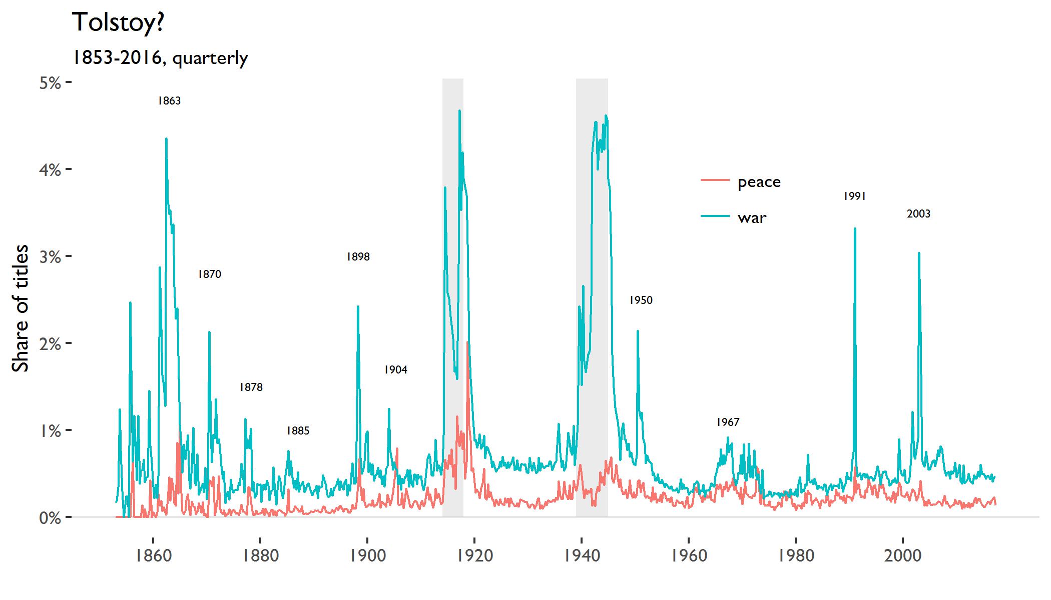
Here is the figure for the words “war” and “peace” (the gray bars are the world wars):
The “war” series jumps, unsurprisingly, around the major wars. Next to the world wars, the American Civil War (starting 1861) stands out. It reaches a new high in the first quarter of 1863 on Lincoln’s signing of the Emancipation Proclamation. The usage of “peace” has a correlation of 0.51 with “war”.
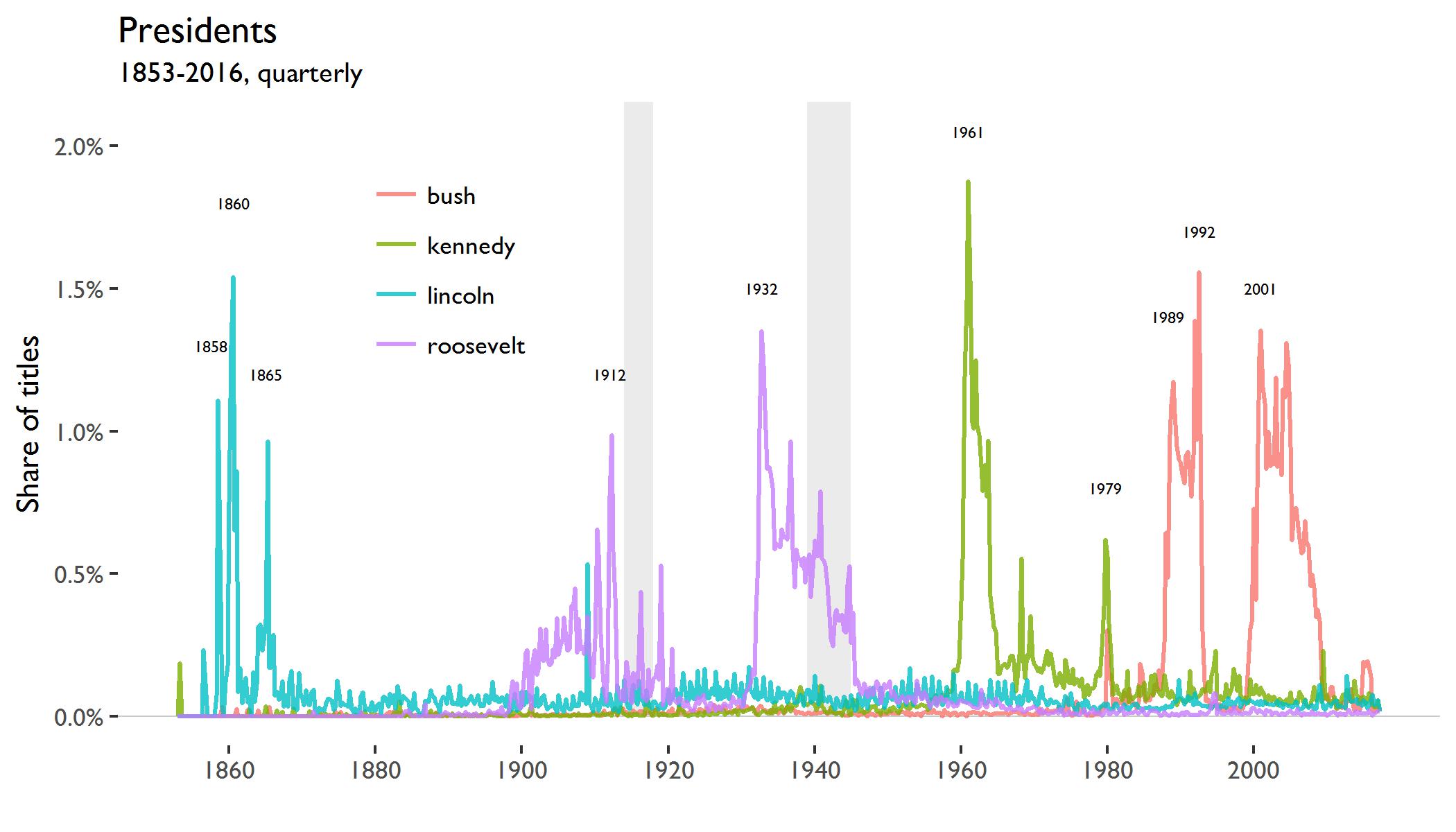
The next figure shows the occurences of the names of U.S. presidents:
“lincoln” spikes first in the third quarter of 1858 during the Lincoln–Douglas debates, then again during the presidential elections of 1860 and last when the Confederate States surrendered in 1865. For “roosevelt” and “bush”, two presidents shared a surname. The name “kennedy” appears during John F. Kennedy’s presidency and then spikes again when Ted Kennedy tried to run for president in the first quarter of 1980.
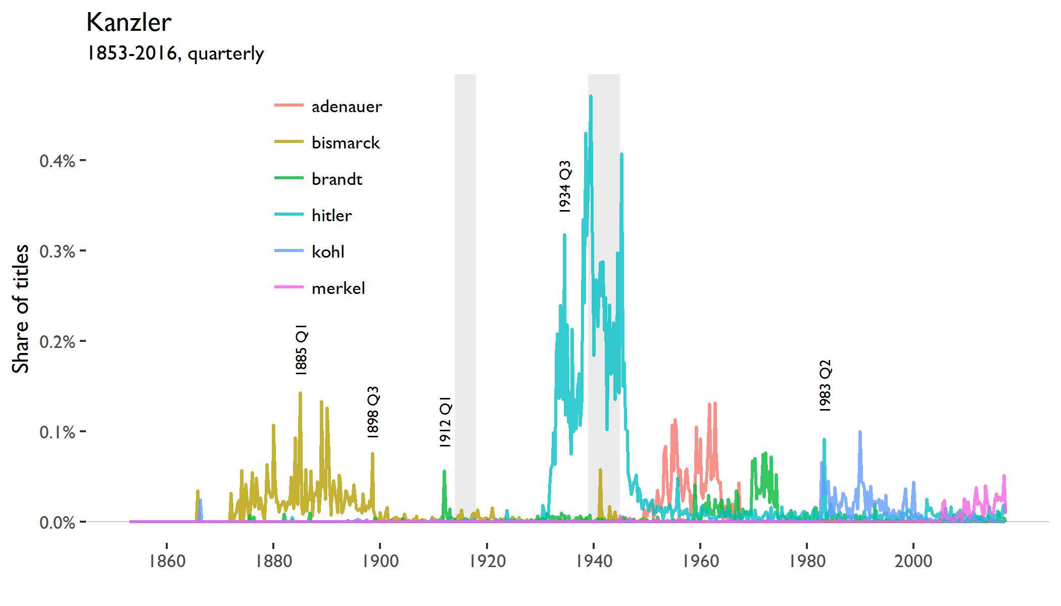
And, staying within my home country:
The fake Hitler diaries were published by the magazine Stern in 1983, so that probably explains that spike. The 1912 spike in “Brandt” might be due to the founding of the German company of the same name in that year.
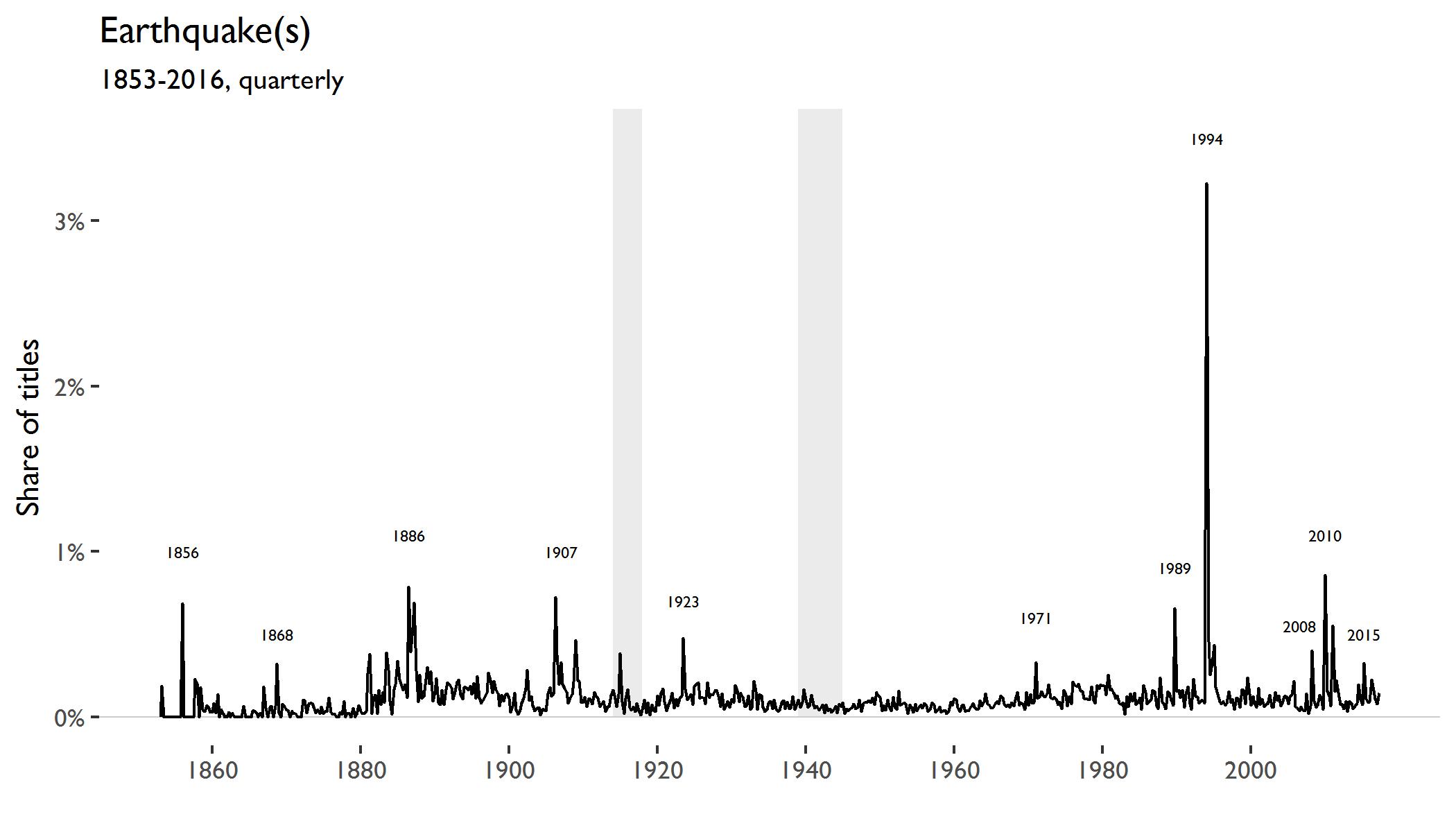
The next figure shows the occurence of “earthquake(s)” in titles.
Large spikes occur around the following earthquakes
Djijelli (1856)
Hayward (1868)
Charleston (1886)
San Francisco (1907)
Kantō (1923)
San Fernando (1971)
Loma Prieta (1989)
Sichuan (2008)
Haiti (2010)
Nepal earthquake (2015)
In 1994, the Northridge earthquake devastated Los Angeles. The big spike in this series is driven by reporting in the Los Angeles Times in which 501 (out of 27,669) titles in the first quarter of 1994 contained the term “earthquake(s)”.
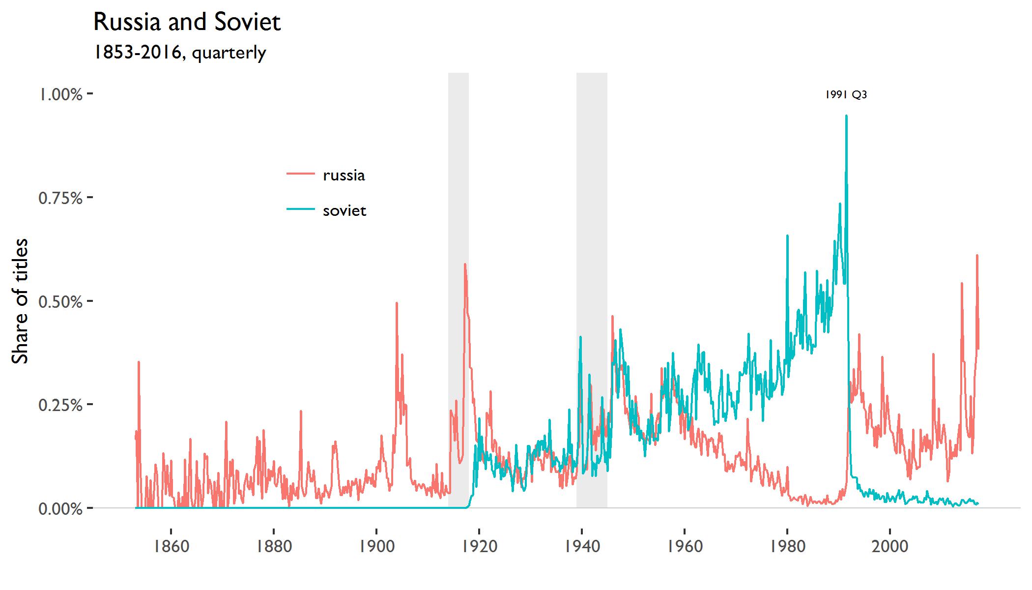
Here are the terms “soviet” and “russia”:
The series for “russia” spikes during the Russo-Japanese War and at the beginning and end of World War I. During the Russian Revolution, the word “soviet” appears for the first time. The two words move together for three decades, but then paths diverge after 1960. The Cold War pitted the West against the Soviet empire and the importance of stand-alone “russia” declined. This changed in the autumn of 1991 when the Soviet Union disassembled and nation states, including Russia, took its place.
Checkout the paper, if you like. I’d be grateful for any comments you might have.
As Pudney (1989) has observed, microdata exhibit “holes, kinks and corners.” The holes correspond to nonparticipation in the activity of interest, kinks correspond to the switching behavior, and corners to the incidence of nonconsumption or nonparticipation at specific points of time.
This is from “Microeconometrics”, by Colin Cameron and Pravin Trivedi and refers here.
Example 2: This one is actually confusing. Likely also with context.
EN: Professors say, students are doing well.
DE: Professoren sagen, Studenten haben es gut.
DE: Professoren, sagen Studenten, haben es gut.
EN: Professors, students say, are doing well.
In the first installment in this series, I documented that term spreads tend to fall before recessions. In the second part I looked at monetary policy and showed that it’s the endogenous reaction of monetary policy that investors predict. I worked with post-war data for the US in both parts, but we can extend this analysis across countries and use longer time series.
The dataset by Jordà, Taylor and Schularick (2016) is great and provides annual macroeconomic and financial variables for 17 countries since 1870. We can use the Stata dataset from their website like this:
# Download datasetmh<-read_dta("http://macrohistory.net/JST/JSTdatasetR2.dta")# Extract labelslbls<-tibble(var=names(mh),label=vapply(mh,attr,FUN.VALUE="character","label",USE.NAMES=FALSE))# Make tidy "long" dataset and merge with label namesmh<-mh%>%gather(var,value,-year,-country,-iso,-ifs)%>%left_join(lbls,by="var")%>%select(year,country,iso,ifs,var,label,value)%>%mutate(value=ifelse(is.nan(value),NA,value))
Check out the dataset:
mh# A tibble: 61,200 x 7# year country iso ifs var label value# <dbl> <chr> <chr> <dbl> <chr> <chr> <dbl># 1 1870. Australia AUS 193. pop Population 1775.# 2 1871. Australia AUS 193. pop Population 1675.# 3 1872. Australia AUS 193. pop Population 1722.# 4 1873. Australia AUS 193. pop Population 1769.# 5 1874. Australia AUS 193. pop Population 1822.# 6 1875. Australia AUS 193. pop Population 1874.# 7 1876. Australia AUS 193. pop Population 1929.# 8 1877. Australia AUS 193. pop Population 1995.# 9 1878. Australia AUS 193. pop Population 2062.# 10 1879. Australia AUS 193. pop Population 2127.# ... with 61,190 more rows
Importing Stata datasets with the haven package is pretty neat. In the RStudio environment, the columns even display the original Stata labels.
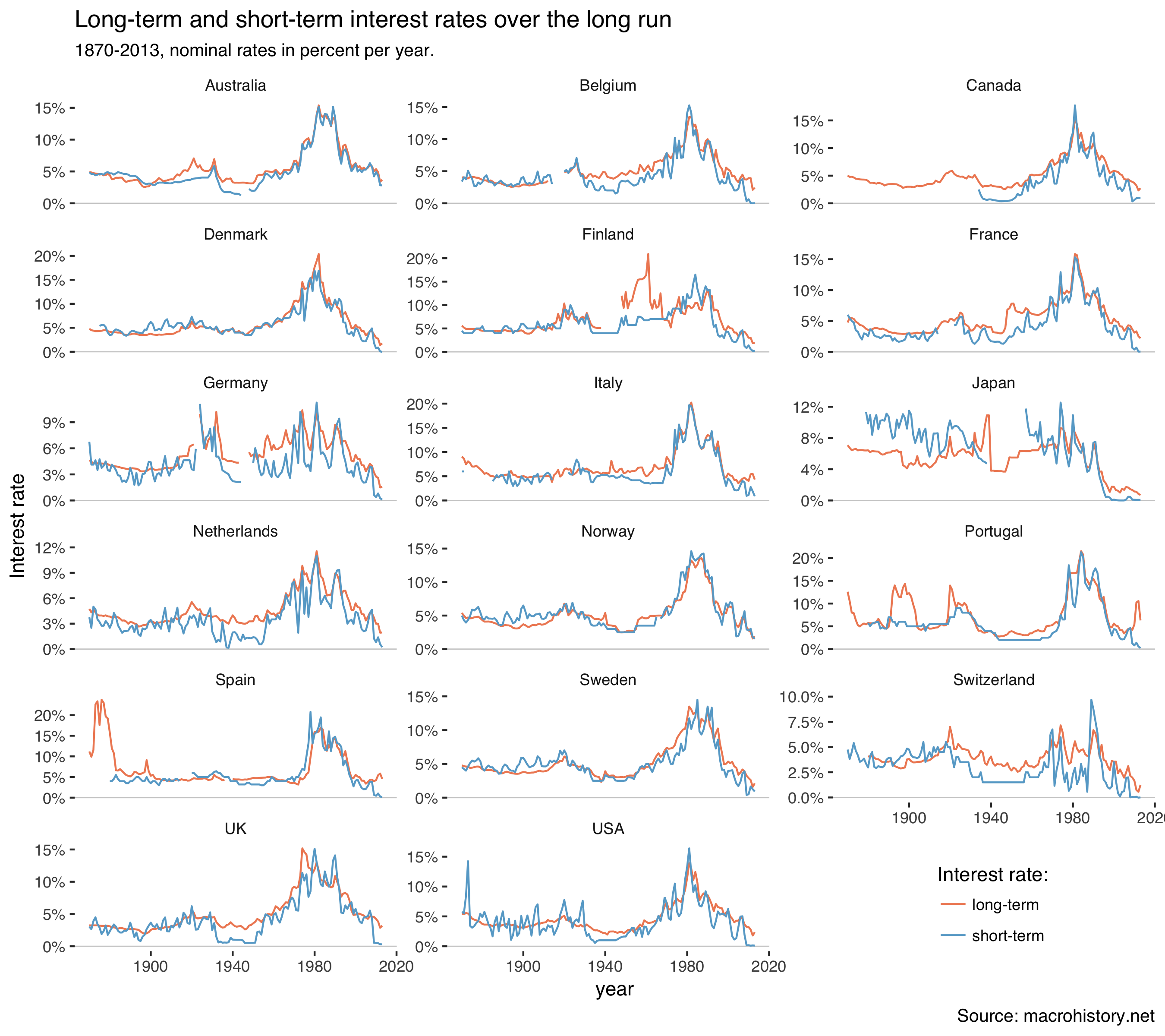
There are two interest rate series in the data and the documentation explains that most short-term rates are a mix of money market rates, bank lending rates and government bonds. Long-term rates are mostly government bonds.
Homer and Sylla (2005) explain why we usually study safe rates:
The method of using minimum rates to determine interest rate trends is informative. Today the use of „prime rates“ and AAA averages is customary to indicate interest rate trends. There is a very large range of rates higher than minimum rates at all times, and there is no top limit except legal maxima. Averages of rates, if the did exist, might be merely averages of good credits with bad credits. The lowest regularly reported rates, excluding eccentric rates, comprise a practical limit comparable over time. Minimum rates will not show us where most funds were lending, but they should provide a fair index number for measuring long-term interest rate trends. (p.140)
And:
The level of interest rates is a more complex concept than the trend of interest rates. (p.555)
So let’s plot those interest rates:
mh%>%filter(var%in%c("stir","ltrate"))%>%ggplot(aes(year,value/100,color=var))+geom_hline(yintercept=0,size=0.3,color="grey80")+geom_line()+facet_wrap(~country,scales="free_y",ncol=3)+theme_tufte(base_family="Helvetica")+scale_y_continuous(labels=percent)+labs(y="Interest rate",title="Long-term and short-term interest rates over the long run",subtitle="1870-2013, nominal rates in percent per year.",caption="Source: macrohistory.net",color="Interest rate:")+theme(legend.position=c(0.85,0.05))+scale_color_manual(labels=c("long-term","short-term"),values=c("#ef8a62","#67a9cf"))
Which gets us:
Interest rates were high everywhere during the 1980s when inflation ran high. Rates were quite low in the 19th century. There are also some interesting movements in the 1930s.
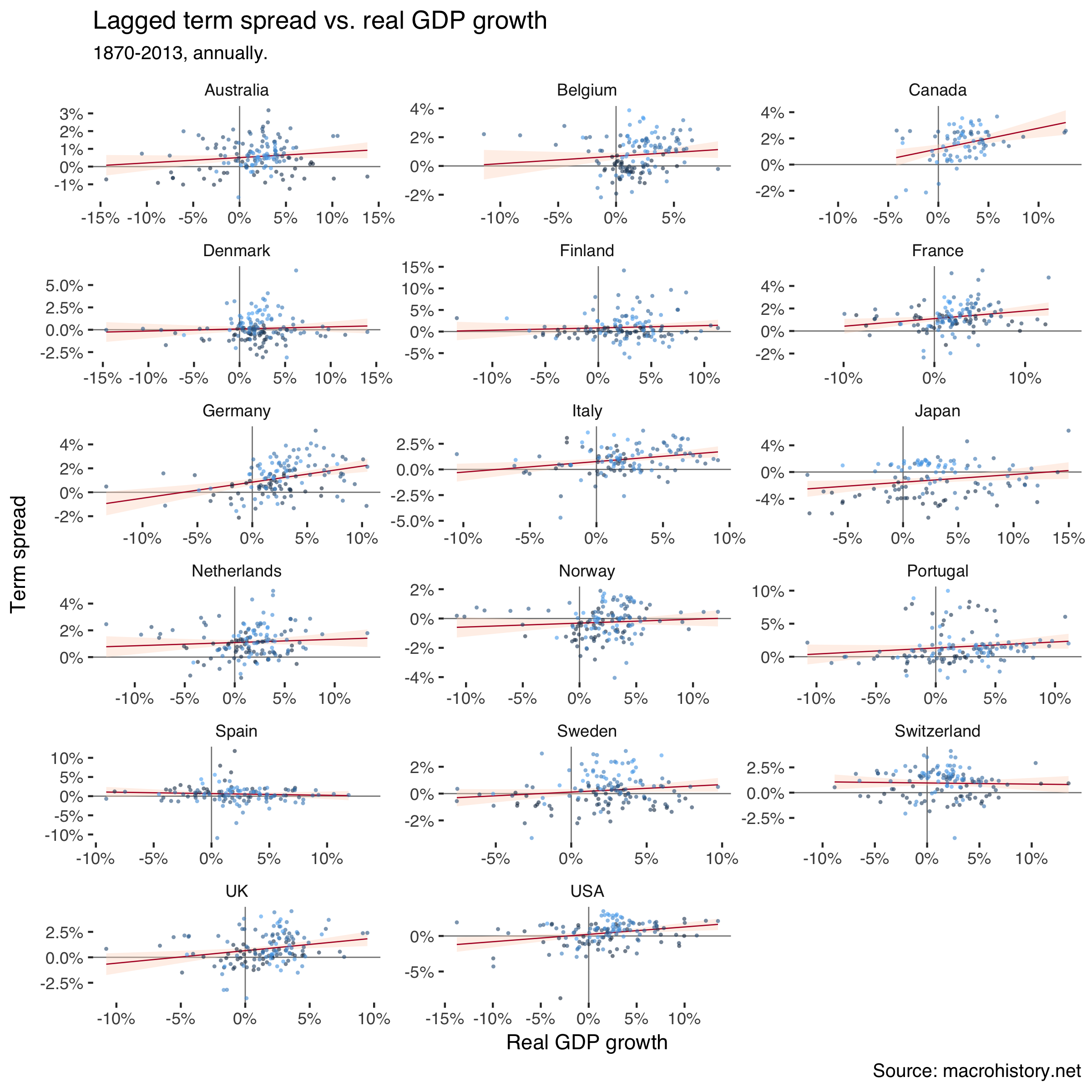
Next, select GDP and interest rates, calculate the term spread and lag it:
df# A tibble: 2,448 x 12# year country iso ifs ltrate rgdpmad stir trm_spr trm_spr_l# <dbl> <chr> <chr> <dbl> <dbl> <dbl> <dbl> <dbl> <dbl># 1 1870. Austra… AUS 193. 4.91 3273. 4.88 0.0318 NA # 2 1871. Austra… AUS 193. 4.84 3299. 4.60 0.245 0.0318# 3 1872. Austra… AUS 193. 4.74 3553. 4.60 0.137 0.245 # 4 1873. Austra… AUS 193. 4.67 3824. 4.40 0.272 0.137 # 5 1874. Austra… AUS 193. 4.65 3835. 4.50 0.153 0.272 # 6 1875. Austra… AUS 193. 4.51 4138. 4.60 -0.0927 0.153 # 7 1876. Austra… AUS 193. 4.57 4007. 4.60 -0.0341 -0.0927# 8 1877. Austra… AUS 193. 4.39 4036. 4.50 -0.111 -0.0341# 9 1878. Austra… AUS 193. 4.44 4277. 4.80 -0.357 -0.111 # 10 1879. Austra… AUS 193. 4.60 4205. 4.90 -0.297 -0.357 # ... with 2,438 more rows, and 3 more variables: gr_real <dbl>,# numdate <int>, outlier_gr_real <lgl>
Scatter the one-year-before term spread against subsequent real GDP growth:
df%>%filter(!outlier_gr_real)%>%ggplot(aes(gr_real/100,trm_spr_l/100))+geom_hline(yintercept=0,size=0.3,color="grey50")+geom_vline(xintercept=0,size=0.3,color="grey50")+geom_smooth(method="lm",size=0.3,color="#b2182b",fill="#fddbc7")+geom_jitter(aes(color=numdate),size=1,alpha=0.6,stroke=0,show.legend=FALSE)+facet_wrap(~country,scales="free",ncol=3)+theme_tufte(base_family="Helvetica")+scale_y_continuous(labels=percent)+scale_x_continuous(labels=percent)+labs(title="Lagged term spread vs. real GDP growth",subtitle="1870-2013, annually.",caption="Source: macrohistory.net",x="Real GDP growth",y="Term spread")
Which creates:
Lighter shades of blue in the markers signal earlier dates. The clouds are quite mixed, so correlations don’t seem to just portray time trends in the variables.
The relationship doesn’t look as clearly positive as in our previous analysis. Let’s dig in further using a panel regression. I estimate two models where the second excludes outliers as defined above. I also control for time and country fixed effects.
So also using this dataset we find that lower term spreads tend to be followed by recessions.
References
Homer, S. and R. Sylla (2005). A History of Interest Rates, Fourth Edition. Wiley Finance.
Jordà, O. M. Schularick and A. M. Taylor (2017). “Macrofinancial History and the New Business Cycle Facts”. NBER Macroeconomics Annual 2016, volume 31, edited by Martin Eichenbaum and Jonathan A. Parker. Chicago: University of Chicago Press. (link)