H(el)P(ful) filtering
I.
Separating the cycle from the trend of a time series is a common activity for macroeconomists. The choice of how to detrend variables can have major effects on firms and the economy as a whole. For example, the “Credit-to-GDP gaps” by the BIS are used by financial market regulators to decide on how to adjust counter-cyclical capital buffers which could mean that banks have to issue more capital. Estimating a different cycle can therefore directly affect bank profitability.
The usual method to detrend macroeconomic variables is the Hodrick-Prescott (HP) filter. The HP filter is nice, because it’s easy to understand and implement. The choice of \(\lambda\) allows using outside knowledge to set a cycle length that we consider reasonable.
But along came James Hamilton who wrote a paper last year called “Why you should never use the Hodrick-Prescott filter” (published, voxeu, pdf). He criticizes that the HP filter has no theoretical foundation and that it doesn’t accomplish what we would like it to do.
Hamilton proposes a better way to detrend. First, you choose an appropriate cycle length. Then - for every point in time - the trend is the value you would have predicted one cycle ago with a linear regression. To appropriately model time series behavior and (as a nice side effect) capture seasonalities, you pick multiples of 4 for quarterly and of 12 for monthly frequencies.
In this post, I’ll show how to implement the new Hamilton detrending method and compare it with the HP filter. I’ll take one of the variables that Hamilton uses in his paper and get exactly the same values.
II.
First, load some packages (see here how to use FredR):
library(tidyverse)
library(data.table)
library(zoo)
library(lubridate)
library(ggthemes)
library(FredR)
library(modelr)
library(mFilter)
Insert your FRED API key below:
api_key <- "yourkeyhere"
fred    <- FredR(api_key)
Get nonfarm employment data from Fred. We keep only end of quarter values to use the same sample as Hamilton (first quarter of 1947 to last quarter of 2016). And we transform the data the same way (“100 times the log of end-of-quarter values”):
df <- fred$series.observations(series_id = "PAYEMS") %>%
  mutate(date = as.yearmon(date)) %>%
  select(date, emp = value) %>%
  mutate(emp = 100 * log(as.numeric(emp))) %>%
  filter(month(date, label = TRUE) %in% c("Mar", "Jun", "Sep", "Dec")) %>%
  mutate(date = as.yearqtr(date)) %>%
  filter(date >= as.yearqtr("1947 Q1"),
         date <= as.yearqtr("2016 Q2"))
We use the HP filter from the mFilter package like this:
hp <- hpfilter(df$emp, freq = 1600, type = "lambda")

df <- df %>%
  mutate(hp_trnd = c(hp$trend),
         hp_cl = hp$cycle)
The dataframe then looks like this:
df

# A tibble: 278 x 4
# date            emp hp_trnd  hp_cl
# <S3: yearqtr> <dbl>   <dbl>  <dbl>
# 1 1947 Q1       1068.   1068.  0.407
# 2 1947 Q2       1069.   1068.  0.458
# 3 1947 Q3       1070.   1069.  0.939
# 4 1947 Q4       1071.   1069.  1.38
# 5 1948 Q1       1071.   1070.  1.19
# 6 1948 Q2       1072.   1070.  1.56
# 7 1948 Q3       1072.   1070.  1.71
# 8 1948 Q4       1072.   1071.  0.688
# 9 1949 Q1       1070.   1071. -1.53
# 10 1949 Q2       1069.   1072. -3.14
# ... with 268 more rows
Get NBER recession dummies:
usrec <- fred$series.observations(series_id = "USREC") %>%
  mutate(date = as.yearmon(date)) %>%
  select(date, rec = value) %>%
  mutate(date = as.yearqtr(date)) %>%
  filter(date >= as.yearqtr("1947 Q1"),
         date <= as.yearqtr("2016 Q2")) %>%
  filter(rec == 1)
Plot the data against the HP trend:
ggplot() +
  geom_rect(aes(xmin = date - 0.5, xmax = date + 0.5, ymin = -Inf, ymax = Inf),
            data = usrec, fill = "gray90") +
  geom_line(data = df, aes(date, hp_trnd), color = "#ca0020") +
  geom_line(data = df, aes(date, emp)) +
  theme_tufte(base_family = "Helvetica") +
  labs(title = "Employment in levels and HP filter", x = NULL, y = NULL,
       subtitle = "1947 Q1-2016 Q2, quarterly",
       caption = "Note: Gray shaded periods are NBER recessions.") +
  scale_x_continuous(breaks = seq(1950, 2010, by=10))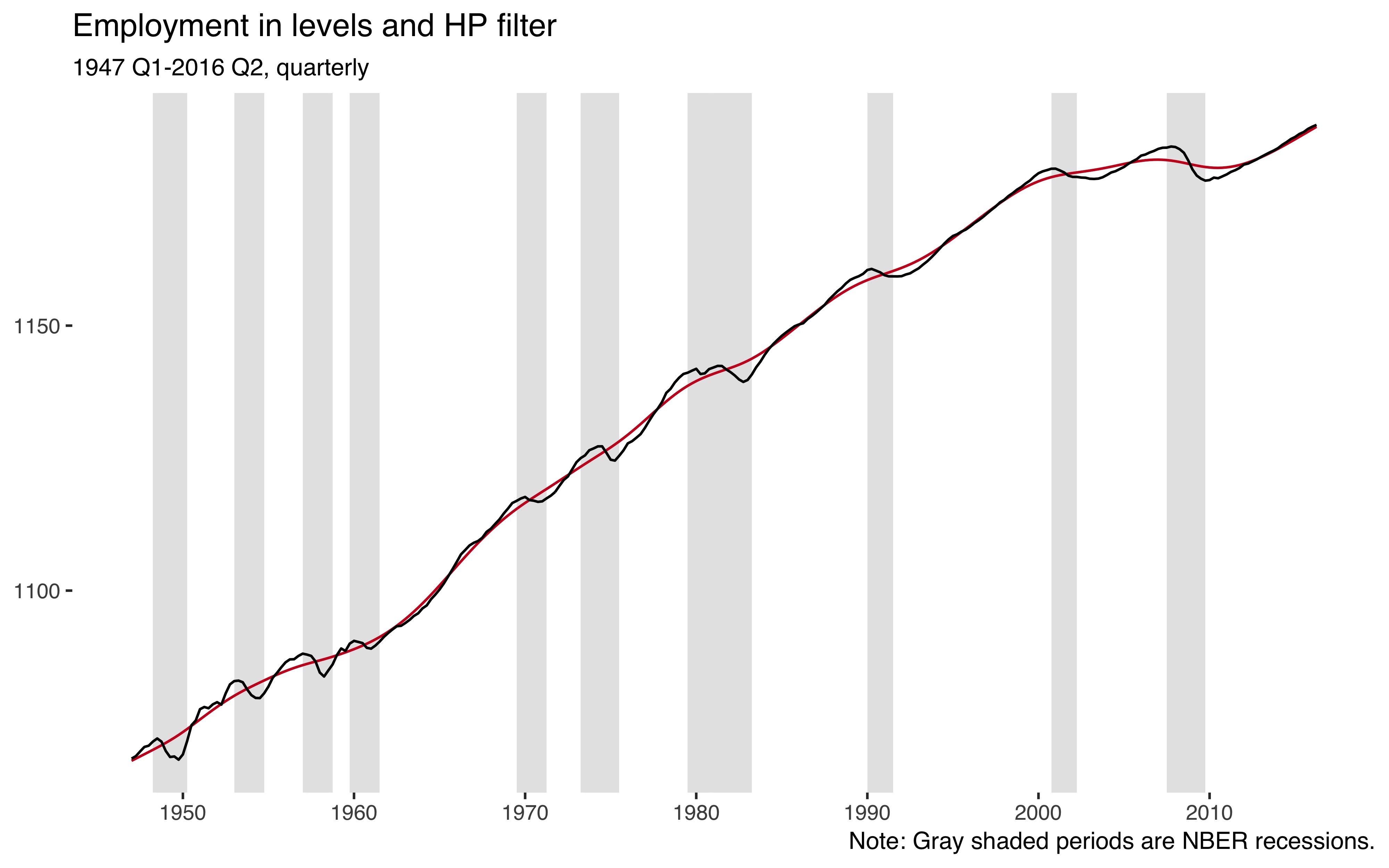
So employment is an upwards trending variable and the HP filter (red line) nicely captures that trend.
Next, I implement the new procedure from Hamilton (2017). First, we’ll need some lags of our employment variable. For this, I like to use data.table:
nlags <- 8:11
setDT(df)[, paste0("emp_lag", nlags) := shift(emp, nlags, type = "lag"), ]
If the true data generating process was a random walk, the optimal prediction would just be its value two years ago. We can calculate this random walk version (\(y_{t} - y_{t-8}\)) right away:
df <- df %>%
  mutate(cl_noise = emp - emp_lag8)
We want to now regress the current level of the employment variable on lags 8 to 11.
Create the expression for the linear model:
rstr <- paste0("emp ~ ", paste(paste0("emp_lag", nlags), collapse = " + "))Check it out:
rstr
# [1] "emp ~ emp_lag8 + emp_lag9 + emp_lag10 + emp_lag11"
Run the regression:
rmod <- lm(rstr, data = df)Add fitted values and calculate the cyclical part:
df <- df %>%
  add_predictions(rmod, var = "trnd_reg") %>%
  as.tibble() %>%
  mutate(cl_reg = emp - trnd_reg)
Create a new dataframe that pits the two cyclical components in tidy (“long”) fashion against it other:
cc <- df %>%
  select(date, cl_noise, cl_reg) %>%
  gather(var, val, -date) %>%
  mutate(label = case_when(
    var == "cl_noise" ~ "Random walk",
    var == "cl_reg"   ~ "Regression"))
Which looks like this:
cc

# A tibble: 556 x 4
#   date          var          val label
#   <S3: yearqtr> <chr>      <dbl> <chr>
# 1 1947 Q1       cl_noise  NA     Random walk
# 2 1947 Q2       cl_noise  NA     Random walk
# 3 1947 Q3       cl_noise  NA     Random walk
# 4 1947 Q4       cl_noise  NA     Random walk
# 5 1948 Q1       cl_noise  NA     Random walk
# 6 1948 Q2       cl_noise  NA     Random walk
# 7 1948 Q3       cl_noise  NA     Random walk
# 8 1948 Q4       cl_noise  NA     Random walk
# 9 1949 Q1       cl_noise   1.44  Random walk
# 10 1949 Q2       cl_noise  -0.158 Random walk
# ... with 546 more rows
Plot the new cycles:
ggplot() +
  geom_rect(aes(xmin = date - 0.5, xmax = date + 0.5, ymin = -Inf, ymax = Inf),
            data = usrec, fill = "gray90") +
  geom_hline(yintercept = 0, size = 0.4, color = "grey60") +
  geom_line(data = cc, aes(date, val, color = label), size = 0.9) +
  theme_tufte(base_family = "Helvetica") +
  labs(title = "Cyclical employment",
       subtitle = "1947 Q1-2016 Q2, quarterly",
       color = NULL, x = NULL, y = NULL,
       caption = "See Hamilton (2017) Figure 5.") +
  theme(legend.position = "top") +
  scale_x_continuous(breaks = seq(1950, 2010, by=10))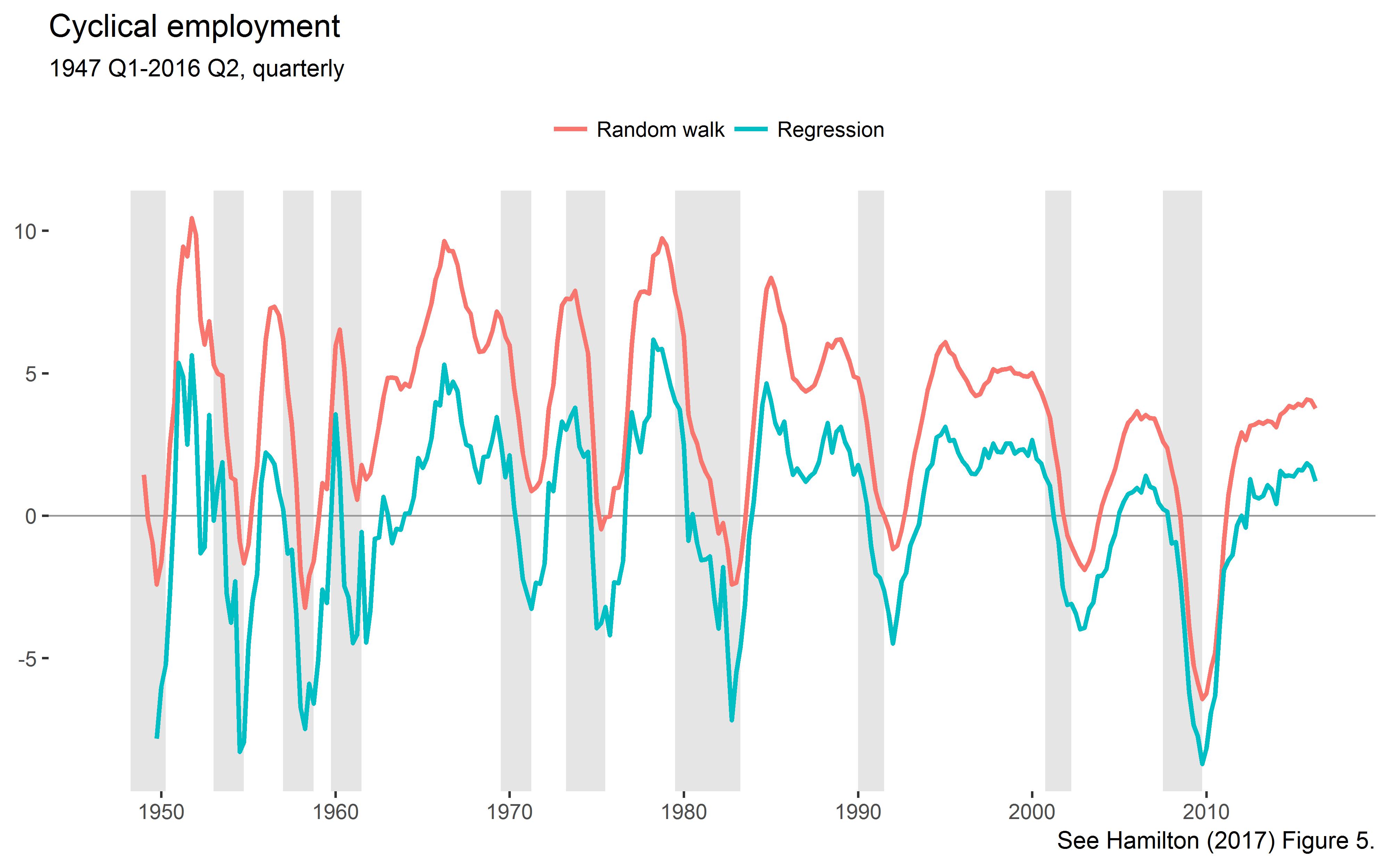
This is the lower left panel of Hamilton’s Figure 5.
Let’s check out the moments of the extracted cycles:
cc %>%
  group_by(var, label) %>%
  summarise(cl_mn = mean(val, na.rm = TRUE),
            cl_sd = sd(val, na.rm = TRUE))

# A tibble: 2 x 4
# Groups:   var [?]
#  var      label           cl_mn cl_sd
#  <chr>    <chr>           <dbl> <dbl>
# 1 cl_noise Random walk  3.44e+ 0  3.32
# 2 cl_reg   Regression  -4.10e-13  3.09
As explained by Hamilton, the noise component has a positive mean, but the regression version is demeaned. The standard deviations exactly match those reported by Hamilton in Table 2.
Let’s compare the HP filtered cycles with the alternative cycles:
ggplot(df, aes(hp_cl, cl_reg)) +
  geom_hline(yintercept = 0, size = 0.3, color = "grey80") +
  geom_vline(xintercept = 0, size = 0.3, color = "grey80") +
  geom_smooth(method = "lm", color = "#ca0020", fill = "#fddbc7", alpha = 0.8,
              size = 0.5) +
  geom_point(stroke = 0, alpha = 0.3, size = 3) +
  theme_tufte(base_family = "Helvetica") +
  labs(title = "Comparing the two detrending methods",
       subtitle = paste0("Correlation: ",
                         round(cor(df$hp_cl, df$cl_reg, use = "complete.obs"), 2),
                         "."),
       x = "HP filter", y = "Hamilton 2017 method")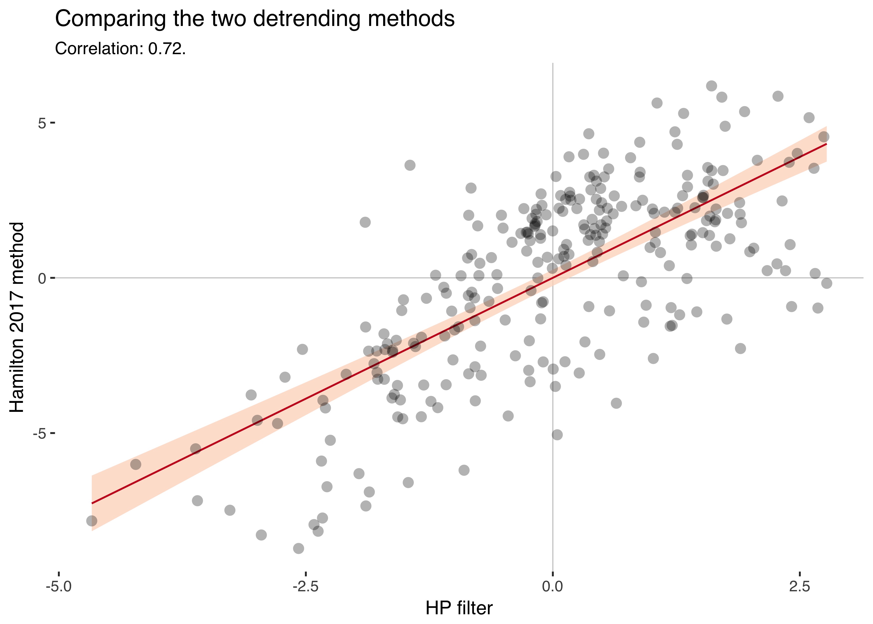
The two series have a correlation of 0.72.
III.
I understand the criticism of the HP filter, but at least everyone knew that it was just a tool you used. You eyeballed your series and tried to extract reasonable trends.
With the new procedure, the smoothing parameter \(\lambda\) is gone, but instead we have to choose how many years of data to skip to estimate the trend. Hamilton recommends taking a cycle length of two years for business cycle data and five years for the more sluggish credit aggregates. Isn’t that a bit arbitrary, too?
Having to pick whole years as cycle lengths also makes the method quite coarse-grained, as the parameter “years” can only be set to positive integers. Another downside is that the new method truncates the beginning of your sample, because you use that data to estimate the trend. This is a nontrivial problem in macro, where time dimensions are often short.
The Hamilton detrending method has additional benefits, though: It’s backward-looking, while the HP-filter also uses data that’s in the future (but an alternative backward-looking version exists). Also, it adjusts for seasonality by default.
We can only benefit from a better understanding of the problems of the HP filter. And we can always compare results using both methods.
References
Hamilton, James D. (2017). “Why you should never use the Hodrick-Prescott filter.” Review of Economics and Statistics. (doi)